Supernatural Title Cards – A Deep Analysis – Part Two
Special Presentations
Supernatural has produced four title sequences for very special episodes; “A Very Special Christmas” (3.08), “Monster Movie” (4.05), “Monster at the End of this Book” (4.18), and “Changing Channels” (5.08). Each is very unique.
A Very Supernatural Christmas (3.08)

The title sequence is preceded by a version of the old CBS Special Presentation Indent. Sleigh bells are heard and a cheery bright yellow Christmas ornament appears and then explodes in a red/yellow inferno. The text appears and, while the traditional colors of Christmas are red and green, the show keeps the cold color of blue for the title, and red for the remaining text. The “Very” flickers in and out like an old motel sign, and then eventually disappears. The askew Santa hat landing classic … gives us the feeling of a comic child-like story. However, very few Christmas stories include exploding ornaments, reminding us that we are in the unreality of the Winchester world.
Monster Movie (4.05)

It’s back to the golden age of black and white movies for this creepy episode. I’m a huge horror fan, and the classic Universal Studio monsters movies hold a place near and dear to my blackened heart. Who hasn’t seen the classic films The Mummy (1932), Dracula (1931), and Wolfman (1941) depicting the iconic monsters from the old Hollywood era.
“Monster Movie” is funny episode and one of the many Halloween shows Supernatural has done during its five seasons, and one of the best stand-alone episodes of the series. Rates high on my Supernatural re-watch list.
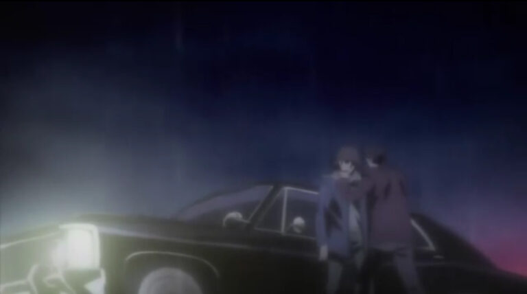
Reminiscent of the classic black and white horror, the title sequence opens as ominous orchestral music swells in the background. The credits roll, superimposed on the rolling clouds of a thunderous lightning storm. We drop from the clouds to a half moon over a wooded rain slick winding road as the impala speeds across the Pennsylvania state line. But wait…lightning flashes and the Welcome to Pennsylvania sign flickers to Transylvania.
The episode followed through with title cards for “Intermission and “The End from the days of the silent movies completing the feeling of nostalgia for the episode.

While black and white cinematography has the artistic advantage of heightening the impact of violence, and highlights the duality of good and evil, this episode is all about fun and bygone days, and a lot like Abbott and Costello meets the monster. The title sequence definitely fits the episode.
The Monster At The End Of This Book (4.18)
The title sequence for the episode featured a noir-themed montage of caricature from covers of the Supernatural books featured in the episode and ended with a title card “Supernatural by Carver Edlund.” Carver Edlund, the pen name used by Chuck Shirley, is an amalgam of the names of Supernatural writers Jeremy Carver and Ben Edlund. One of the illustrations cartoon caricatures bears a strikingly similar to Fabio, who became famous as a model on the cover of romance novels.

The title sequence is based on Hollywood’s classic film noir period that stretched from the early 1940s to the late 1950s. This motif is associated with a low-key black-and-white visual style. Much of the attitude of classic noir is derive from the “hardboiled school’ of crime fiction that emerged in the United States during the Depression, particularly those that emphasize cynical attitudes and sexual motivations.
From the beginning, the viewers know they are going to be treated to a humorous episode more akin to a crime dramas than horror show, and the episode doesn’t disappoint. The boys find a published book series on their hunts packed with exaggeration and dramatic phrases like “Armed with an iron horse and abs of steel, these heroes pack real heat.” The illustration of the impala is similar to its caricature in the unused title sequences of season one.
Changing Channels (5.08)
From the very beginning of the sequence, we can see something is not right. The colors are very bright and extremely saturated, rather unsettlingly so, compared to the bluish filter they usually use. Green is considered the color of peace, ecology and nature, and always has a calming effect on people, maybe a sign of our evolutionary roots. Needless to say, green is not seen in any Supernatural title sequences, until now, a clear sign that there is something very wrong in this episode.
The Supernatural Sitcom Theme Song plays over opening credits which mimic those of a 1980s sitcom even down to the type of font used. The portrayal of a light-spirited (near) ideal family provides the clearest example of the dangers of our normality in the Winchester world, reminding us of the brothers’ tragic lives and their own detachment from accepted society. An occasional viewer of the series would be quite disorientated by this intro.
For me, I found this opening to be disturbing and disquieting. The reality is familiar, yet abnormal at the same time. The brothers were caricatures of themselves, playing grotesquely exaggerated versions of people, taking familiar traits and exaggerating them for humor. The sequence aptly depicted the episode…very funny but very malevolent.
Season Six
With the onset of season six, what would we expect of the new title card? With the ending of a five year odyssey, a good argument could be made for a completely new design, graphics and logo for the title. Certainly the world would stay dark and gloomy with blues and reds predominating especially if angels and demons remain a part of the storyline. The zooming “SUPERNATURAL’ text in and out of focus would be a consistence they might want to continue. However with the consistency they have used for five years, it’s hard to imagine they would completely abandon their current design. For me, I’ll be happy with whatever they choose, because at least there is a season six title sequence to watch!


Hi Sablegreen
These are great. I loved them all.
The Christmas and The Monster Movie ones reminded me so much of when I was a kid. I too loved watching all those old scary movies and especially the Abbott and Costello ones.
Sablegreen, I also loved these ‘Special presentations’ so much! I loooooveee those old horror movies, the Bela Lugosi Dracula and The Creature From The Black Lagoon. Whenever they are on tv I watch them, but I own the ‘Creature’ on dvd and watch it once in a while for being a huge fan of the monster that always gets to my heart…. Sigh, sentimental soul that I am….
The Christmas one I loved but didn’t know the model for it, as I haven’t seen that, of course living in Europe, yada,yada… Loved the Changing Channels opening… loved it loved it loved it will continue loving it
Thanks for all the work and love you put into this. Cheers ever! Jas
Really enjoyed part 2. Loved the videos and looking forward to Season 6. Thanks for sharing.
Loved part 2 as well–awesome job, again You’re right, there is something disconcerting about the Changing Channels title sequence, as completely hilarious as it is… Loved the pulp fiction montage for TMATEOTB too–really wish they’d used it again for “Real Ghostbusters”!
And AVSC’s just classic– the electric blue letters definitely accentuated the creepy… as does the font. I love the Supernatural lettering font, it’s so chilly and menacing; I’ve rarely been so tenacious about anything as I was about finding and downloading that font (or a close fascimile thereof)–an improvement from S1’s font, IMHO…
Thanks again ElenaM. CC’s card was definitely unsettling, but then it was supposed to be, really depicted the episode well. Funny side note: I read somewhere that in between takes, the boys were riding those mini bikes all over the set. 😆 Nothing like having fun at work!
If you found the font for AVSC, can you send me a link? Really would like to use it sometime!
Thanks again for reading.
Sabe, I don’t have the Christmas font, just the regular title font (or more like a nice fan-made facsimile thereof) and the link isn’t working anymore, so I’ll try sending the ttf file to you as an email attachment