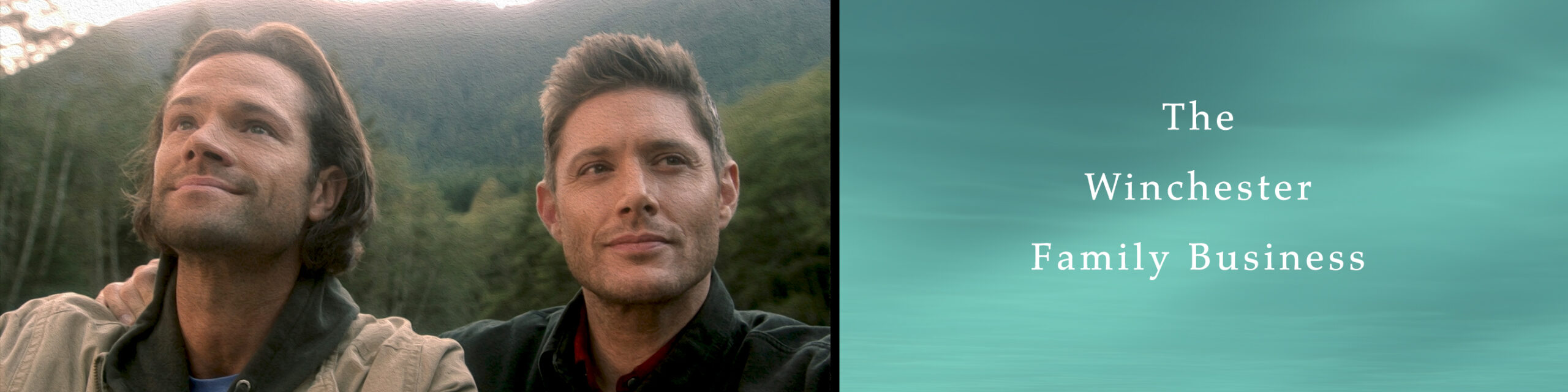
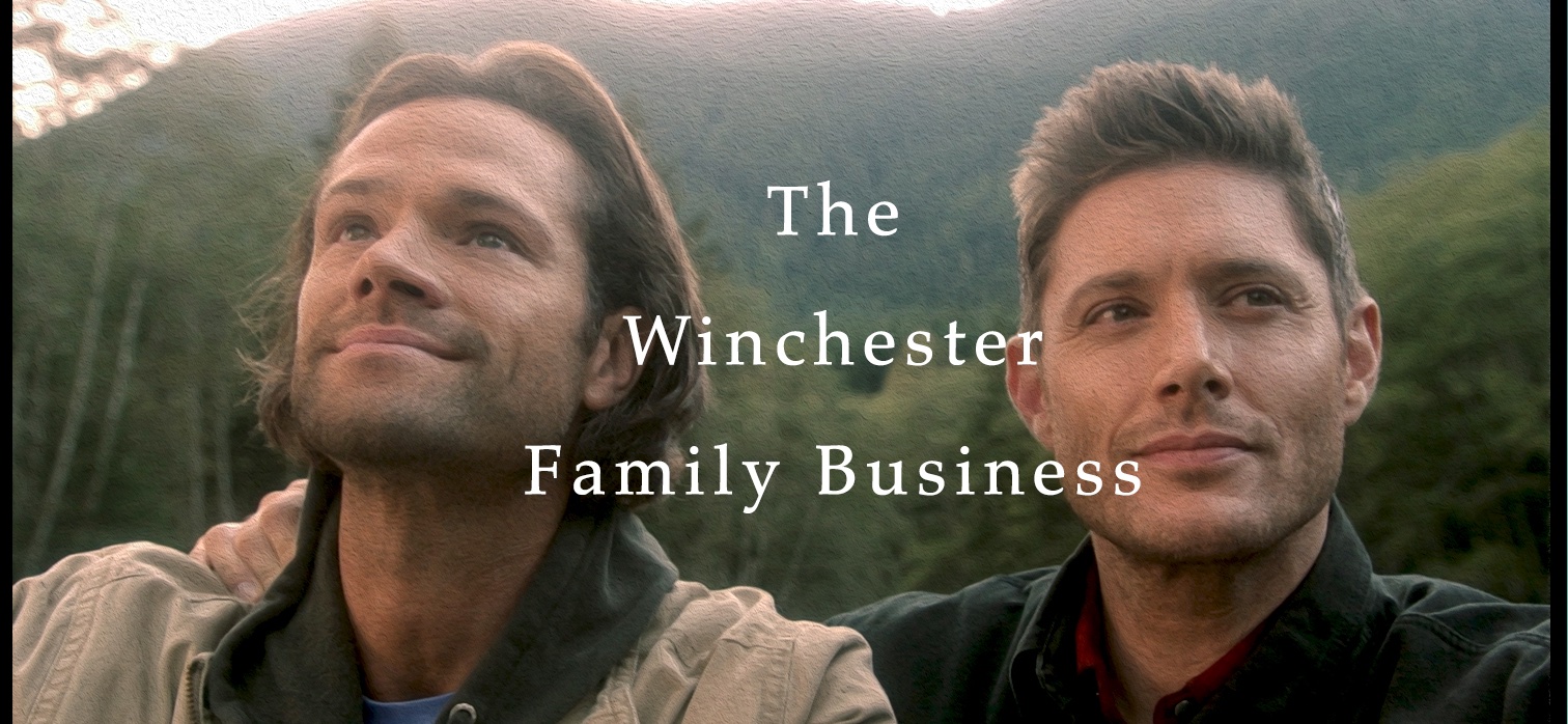
Supernatural Title Cards – A Deep Analysis – Part One
Title sequences, also called title cards, are methods by which cinematic films or television programs present their title, key production and cast members utilizing visual imagery and sound, and usually follows the opening credits. But Supernatural is known for not having opening credits, and instead goes for a cold open (or teaser), the technique of jumping directly into a story at the beginning of the hour, and a title sequence with the show’s logo and graphics. The opening credits for the series are then superimposed over the opening scenes of the episode.
Just to set the mood, the following analysis features videos of all of the seasons’ title sequences, and some of the special stand-alone episodes they have done over the years. It also includes two never used ones produced for season one.
“Supernatural” Title Sequences
Title sequences are visual imagery described as “he conveyance of ideas and information in forms that can be read or looked upon.” Visual communication solely relies on vision, and is primarily expressed with two dimensional images, including signs, typography, drawing, graphic design, illustration, and color. It also explores the idea that a visual message accompanying text has a greater power to inform, educate, or persuade a person or audience.
Reality in TV is rather subjective but can be carefully constructed utilizing visual concepts. Imagery involves one or more of your five senses (hearing, taste, touch, smell, sight). In title sequences, sight and sound are used to set the mood. Words, colors and noise are used to stimulate your memory of those senses, and as Supernatural is a horror/sci-fi show, negative memories are what the series wants to encourage. The main ingredient within horror is that the viewer can relate to it somehow, and that there is always something unexpected approaching. The whole genre is build upon people’s fear of the unknown and anxieties. According to H.P. Lovecraft, “The oldest and strongest emotion of mankind is fear, and the oldest and strongest kind of fear is fear of the unknown.”
The graphic presentation of the titles cards incites fear, danger and anxieties in the audience getting our focus, and setting the stage for the shows content, in this case the Winchester normality. In their world, our type of normality is an illusion, and not knowing the truth can get you killed. Supernatural‘s cold open and title sequences invite us into the darkness, where reality hides. The Winchesters can’t be part of our normality, so we must enter theirs. Pulling us into their world quickly gets us set for the various levels of chaos, distortion and conflict we will experience.
The artists have used drawings, illustrations and signs to envelope us in the paranormal, occult, ancient mythology, monsters, ghouls and magic. Supernatural‘s title sequences relies on graphics, sound and color. Color is the first aspect people see, and, without our realizing it, can have a profound effect on how we feel both mentally and physically.
While perceptions of color are somewhat subjective, our reaction to color is instantaneous. There are some color effects that have universal meaning. Supernatural title cards make use of all colors of the spectrum and a brief discussion of the colors used will help explain why they give the effects they do and why the artists chose them for the title sequences.
Colors in the red area are warm colors. We associate red with love, danger, violence, anger and energy. Red can evoke a fight-or-flight response; raise blood pressure and increase heart and breathing rates allowing the body to react quickly in survival situations. It is often where the eye looks first, and can be seen from the farthest distance; hence society uses it on emergency exits and stop signs. Red is all about excitement and energy which is why red cars get more tickets. Ticket givers notice the movement of the red car more prominently, and from a much farther distance. Thieves also have a preference for red cars. More of an energy surge associated with stealing it.
Red is the symbol of life and the color of blood……that life giving liquid we all squirm when we see oozing and seeping in areas outside of the body, especially is large quantities. Not surprising this color is used in all of the season’s title cards. Danger, violence, and blood are always in the Winchester world.
Yellow is another color that Supernatural uses in abundance. Cheerful sunny yellow is an attention getter. However, people lose their tempers more often in yellow rooms, and babies will cry more. It is the most difficult color for the eye to take in, so it can be overpowering if overused. And that overpowering effect is used in a number of the title sequences.
Colors on the blue side of the spectrum are known as cool colors and include blue, purple, and maroon. These colors are often described as calm, but can also call to mind feelings of sadness or indifference. Purple and maroon embodies the balance of red simulation and blue calm. This dichotomy can cause unrest or uneasiness. Blue represents peace and harmony, but also depression. Blue can slow the pulse rate, lower body temperature, and reduce appetite, applications that in our normality are a signs of sickness or death. The opposite effect as red, blue is cold and depressing, a reaction Supernatural is going for.
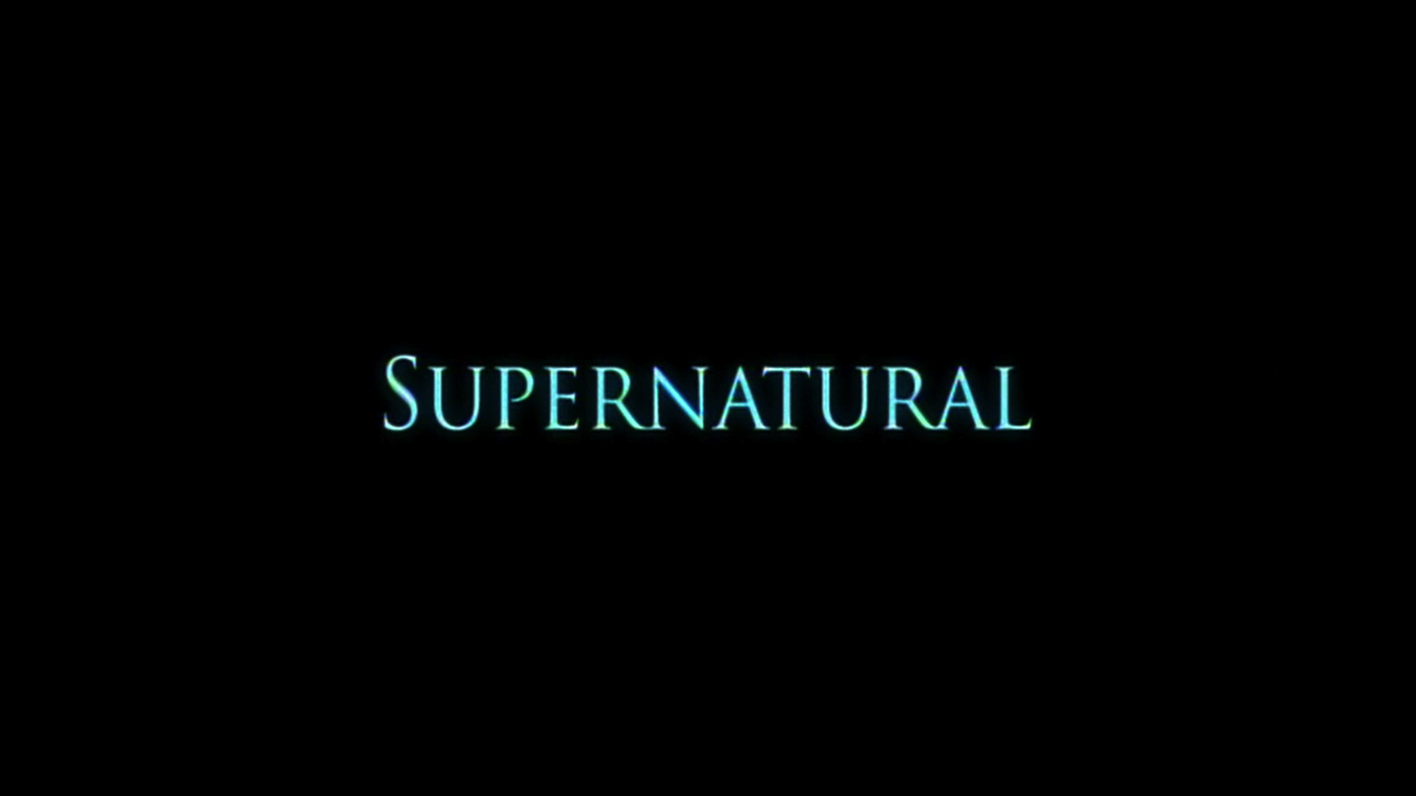
Black represents evil at its apex. The cowboy in the black hat was almost always the “bad guy”. It represents power, sexuality, sophistication, elegance, mystery, fear, evil, sadness, mourning and death. It’s a serious color that evokes strong emotions, and too much black can easily overwhelm people. Not surprising that all of the title sequences start with black background, the total absence of light and color.
Each season’s title cards had something to do with the overall story or plot of the season. Though the titles cards have changed every year, some aspects have remained the same, and though all have different elements, all have a level of sophistication that makes them equally great, especially since you can see how each title sequences fits in so well with its particular season.The show has also deviated from season’s title sequences for extraordinary episodes where they were going after a very special effect, A Very Special Christmas (3.08), Monster Movie (4.05), Monster at the End of this Book (4.18), and Changing Channels (5.08).Those are discussed later in the article.
All the season title sequences begin with an explosion of color. In season one, a bright flash of blue erupts on the screen and then fades to the original black color. In season two, the colors of reds, orange and yellow explode into a fire ball of blinding white light. Season three starts off with a big bang of white hot light, which eventually drifts into a cold expanding galaxy. In season five, the black background disappears into a white hot light from which a dark color explodes in a swirling red field and then returns to is white hot background. Even their special presentation, A Very Special Christmas, started with a yellow ornament that exploded into a hot red yellow color, and then dissipated into a white field for the subsequent graphics. With tremendous force, and searing heat, explosion always shock onlookers with fear and the feeling of being powerless….certainly aspects of every season of Supernatural.
In all seasons, the series used the single word ‘SUPERNATURAL’ in large and small font, rapidly zooming in and out of focus. The greatest aspect of this part of imagery is its ability to distort our visual perspective, making cognitive and information processing skills difficult at best. The rapid movement of the word gives the feeling of disorientation and loss of control, blurring the distinction between reality and normality, between our world and the Winchester’s. So much so, that we know they’re in danger when their reality turns “normal,” all bright and shiny and optimistic as in the opening of Changing Channels (5.08).
Besides the visual imagery, sound also sets the mood. The sound sequences of all the title cards were similar. The burst of spectral white noise and static with the visual explosion, disconnected clanging, crashing sounds, otherworldly ghostly howling and rushing wind, and the every present beating heart. Season four added a demonic blood curling scream to the mix, which, of course, sends chills down everyone’s spine. Season five’s beating heart was given more emphasis, although it can be heard faintly in other season’s title cards as well.

Now *that* was some tasty meta. At least 75,000 bonus points for the mention of Lovecraft, I’ll have to check my actuarial tables.
For the season four title, I always associated the wings with ravens, those denizens of the battlefield, companions of Odin, Huginn and Muninn, memory and thought, appropriate for this show, given how important memory (family, hunting, tradition) and thought (skills, techniques and grimoires, if you will) are.
I love all five, but I’m kind of partial to season one for the details you mentioned, it’s representation of a coldness, of a lurking in the dismal fog, almost an ubiquitous Lovecraftian cosmic indifference that Sam and Dean bring a humanity to.
Unbelievable! Video sections – breath taking. Marvelous Sable Green. Keep the articles coming. Best I’ve ever read.
Fascinating! I am very partial to season 2 with season 3 title a close second.
And Randal. A Lovecraft fan! I read them many years ago and they were the most bone blood chilling stories ever. Unknown unimagineable forces of nature and ancient ancient sleeping horrors slowly awakening. 😯 😯 😯 😮
Great video! Loved seeing them all together like that! My favorite has always been season 2 when the A becomes the pentagram. I barely noticed any change the next season until I realized the pentagram didn’t come up – I thought I was going crazy when it didn’t. Finally I realized that they changed every season! I love the fact that they’ve done that.
Thanks for commenting all. Randal, ravens are a good analogy. I’ve worked with crows as an animal rehabilitator, and they can really be nasty and HIGHLY protective of their young. A pack of crows taking on a raptor is a frightening sight to see. Guess that’s why I thought of them right off.
Matilda, Bevie and MyMADWorld so glad you liked the videos. A big thank you goes out to Alice who got those all embedded for me, and some of them gave her a lot of grief.
Hope you all enjoy the second half!
Sablegreen, This is an excellent piece. I love how you gave us the video of all the title cards and then broke each one down individually.
I frequently will pause and step still by still through these title sequences to try and catch all that is there. Season 3’s always intrigues me because the first explosion comes forth with two skeletal-type hands coming forward…chilling!
Season 4’s has so many elements with the wings, the scream and the sound of knives slashing (makes me think of the angel swords) and the swirl of Season 5 was used with great glee by so many to fade from the teaser which frequently involved blood splashing or splattering.
The alternatives, especially the second one from Season 1 has a very X-Files feel to it, not surprising, and while I like them, I’m definitely partial to what they did go with.
All of them are awesome and I eagerly await Season 6’s.
Thanks for tackling this unusual subject…I see there’s a part 2, I’ll digest that a little later!
Hi Sablegreen
I always liked that each season had it’s own title card. Kind of gave each year its own identity.
I think season 2 is my favourite.
As for season 3, I never knew it was a pentacle they were showing before the supernatural lettering showed. I could never make it out.
Season 4 always reminded me of Alfred Hitchcock’s The Birds, that movie scared the hell out of me when I was a kid.
And Season 5, I always took it to represent ‘Blood is thicker than water’, especially after the deterioration of the brother’s relationship. Kind of game me hope that things were going to get better.
With articles like this, do we really have do be afraid of Hellatus? My foot! Thanks, dear, for this labour of love.
Where Randal finds his Lovecraft, I see my Poe… the wonderful thing is, that all the symbolism leaves enough to personal interpretation…
I have loved all the intros, as they were unusual in tv land, and I do love the bloody one of season five. Being also a fan of high quality vampire stories, that might come natural….
Love, Jas
Elle2, Karen, Jas..Glad you liked the videos. Elle2, season 3 has so many different elements and is so much more complex than the others which is why I like it the most. I also really liked the first unused season 1 video’s images and graphics, but the audio didn’t go well with it. While I really liked the one they used, I also would have liked this one with a different sound track.
Karen, when I saw season 4’s title card the first thing I thought of was Hitchcock’s The Birds. He gave new meaning to bird flocks.
Jas, love Poe. One of the SPN novels was based on the Poe stories. Wish they would do that as a two part episode in s6. As for this being a labour…not on your life! This was pure joy the whole time. I’ve always had fun doing articles for this site, but this one was the most fun ever. 😀
Thanks for enjoying the piece.
Awesome, fascinating, wonderful analysis–could heap on more superlatives but you get the idea :D. You especially made me view season 3’s differently, its feel of cosmic coldness and the sense it evokes of being between worlds… Thought the eruption of clouds always had a pretty hellish look to it because for me it very much echoed the eruption of demon smoke from the Devil’s Gate.
Personally I’m partial to seasons 2 and 4–I loved the burst of flame and the pentacle star fading into the A, thought that was very cool. For S4, I loved the dark menace of the chiaroscuro effect of the crows’ wings and, like you pointed out, the way that echoed the darkness and mystery of the angel storyline.
Oooh, new season means new title card–can’t wait!!! Off to read part 2.
Glad you liked the article. Season three was always the most mysterious for me, and season 2 was the most energetic of them all. Season 4 just seemed a little ‘quite’ compared to the others, but fit the season wonderfully. Thanks for commenting!
De nada, you deserve it! Thanks for including the alternative S1 title cards too–I really, really liked the first of the two, actually, but can see how a more sudden, abrupt title card is better suited to transition from the teaser to the rest of the episode. Second one, I agree with elle2, felt very X-files to me… Anyway, one more superlative can’t hurt, so great job!!!
De nada, you deserve it! Thanks for including the alternative S1 title cards too–I really, really liked the first of the two, actually, but can see how a more sudden, abrupt title card is better suited to transition from the teaser to the rest of the episode. Second one, I agree with elle2, felt very X-files to me… Anyway, one more superlative can’t hurt, so great job!!!
Ooops… how’d that happen? Excuse the duplicate post, sorry…
ElenaM, funny you liked the first alternative. My mother LOVED that one. She played it a lot. Really I did too. It was very colorful and really depicted the urban monsters and myth they were dealing with in s1. I wouldn’t mind if they switched to something along this format for s6.
I agree with you and Elle2 though, the second was very X-files-ish, wouldn’t want to see it on SPN.