Visual Review: Supernatural 10.17 “Inside Man”
 One of Supernatural’s hallmarks is it’s unique look. It is lucky to have some of the best directors, set designers and lighting artists in the business. The cinematography of “Inside Man” is particularly outstanding, though, so much so that it is worth spending some time focusing on its brilliance.
Here is a partial list of the professionals whose talent elevated this episode:
Writer: Andrew Dabb
Director: Rashaad Ernesto Green
Director of Photography: Serge Ladouceur
Production Designer: John Marcynuk
Film Editor: Nicole Baer
Costume Designer: Kerry Weinrauch
Set Decorator: George Neuman
Glowing Red and Yellow Contrasted by Silver and White
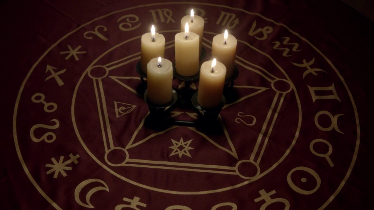
The episode’s color scheme is used for every character and in almost every scene. Bright, glowing colors give the episode an “other worldly” or ethereal feel. The most prominent colors of red and yellow are introduced very early in the episode. The first shot is of the yellow glowing candles atop the reddish tablecloth (above). Notably, the color of the cloth is almost an exact match to the color of Dean’s shirt, which we see in a few minutes.
A few moments later in the opening sequence, our first visual of Bobby’s Heaven is through the back of his old-time radio, illuminated with red and yellow glowing lights.
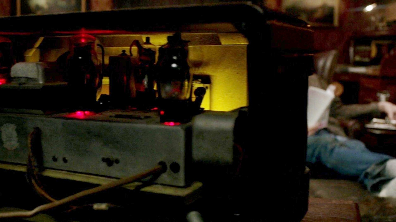
Followed almost immediately by the front of his radio:
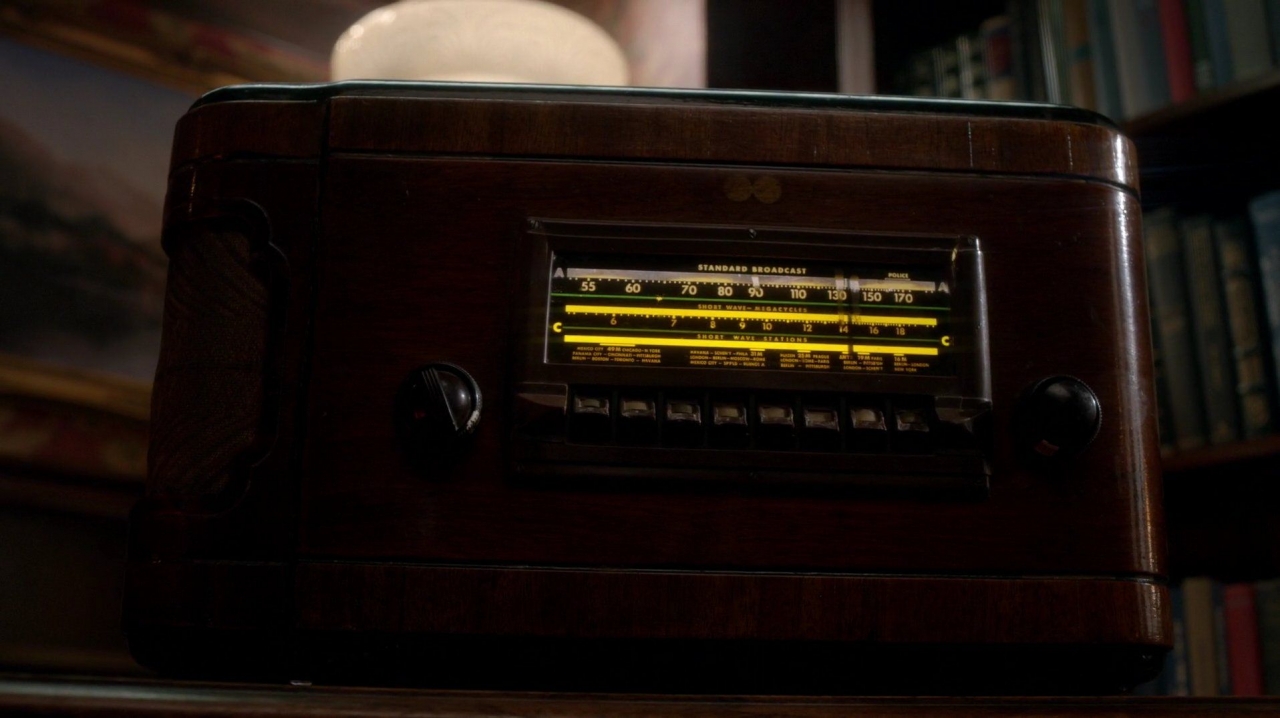
Note for future reference that the bottom two displays are yellow, while the top “A” line which shows the broadcast frequency is white.
The first visual of Sam and Dean in the bunker emphasizes their isolation. Sam is on the phone with Castiel, while Dean is farther away down the stairs. Even when the brothers are brought together, Sam is blocked out. Our visual is of the yellow glowing lamp and Dean’s dark red shirt covering the black tee that lines his body. Red is presumably symbolizing rage, uncontrolled passion or blood (violence) while black is traditionally the color of evil.
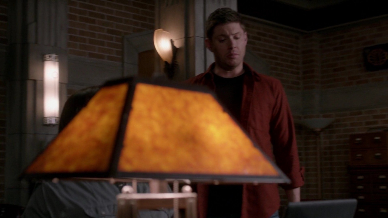
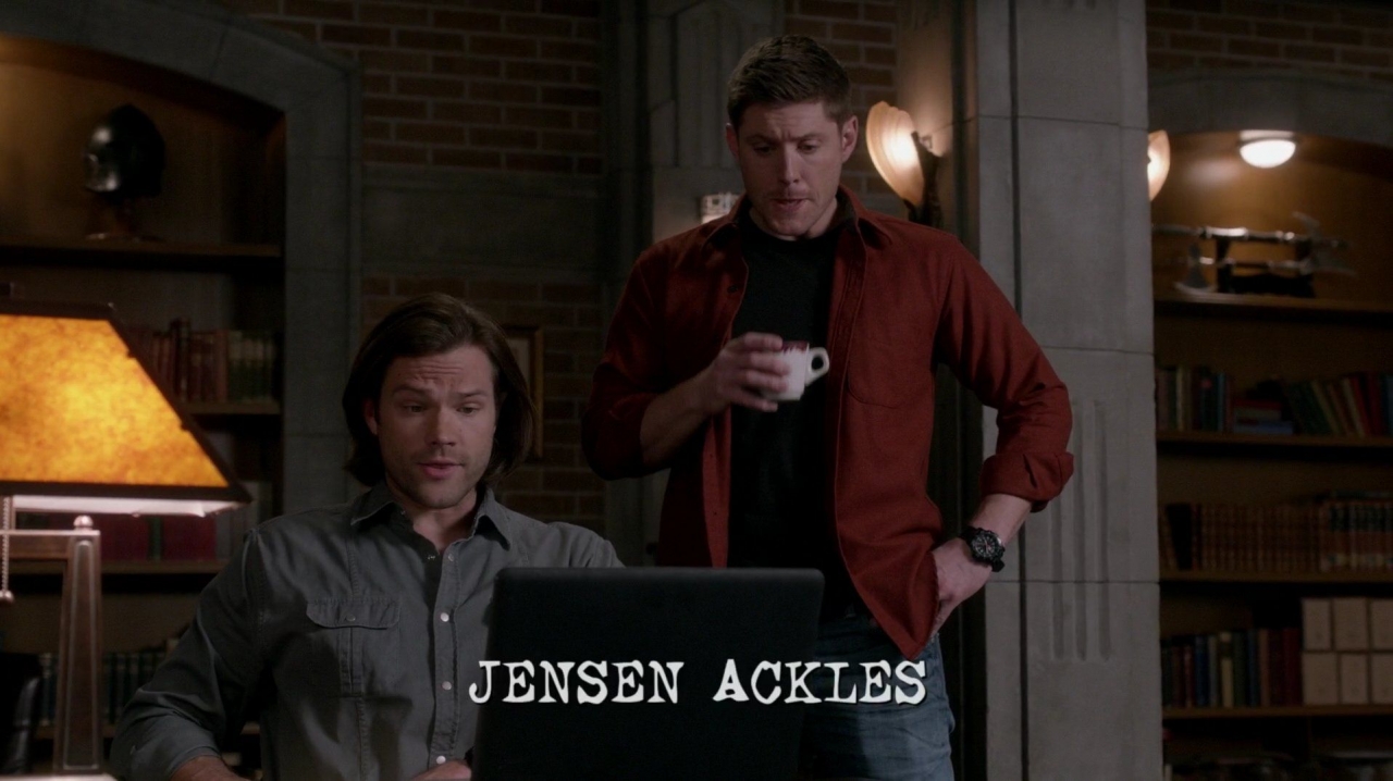
The camera gives us several seconds to absorb Dean’s isolation as he faces his inner demon. Ironically, Jared is completely blocked in the shot that introduces his credit!
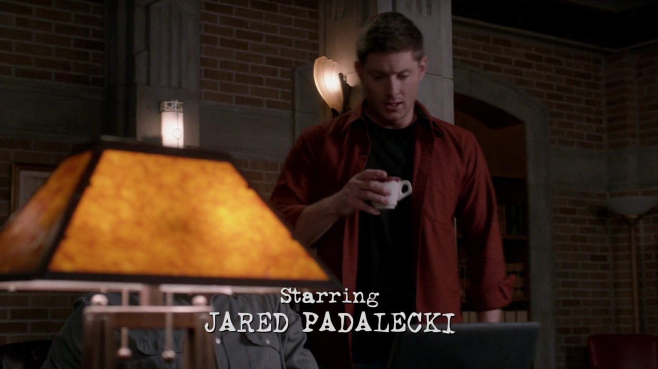
The camera continues to pan to the right, eventually revealing Sam, but his presence is muted compared to Dean’s. Sam’s shirt is a neutral grey that matches and blends in with the color of his computer and the bunker’s stone pillars. Sam belongs in the bunker. He is in harmony with everything around him. He is also seated, while Dean’s presence dominates the shot standing over his brother. Dean is in the center of the frame, directly facing the camera, remaining the primary interest of the shot.
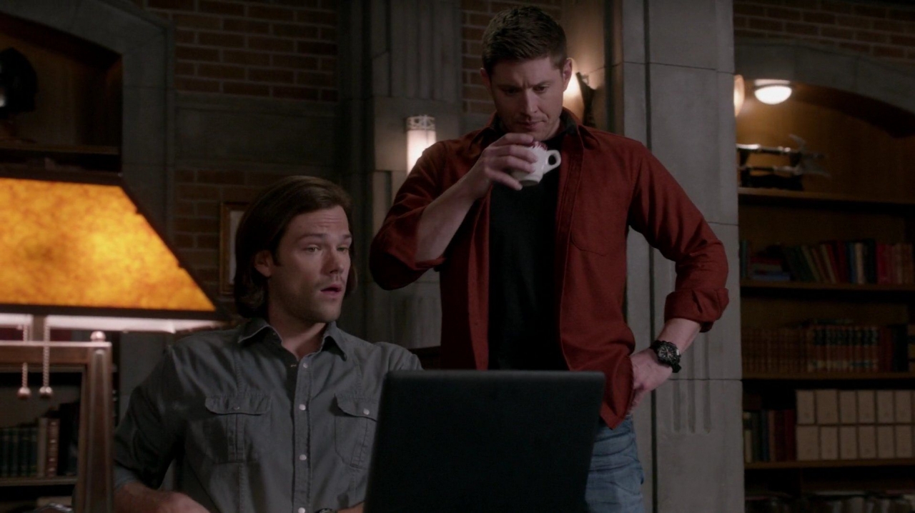
Perhaps symbolically, neither brother is wearing their traditional plaid hunter’s shirts. Their clothing for the day suggests that they won’t be hunting, even before they come to that conclusion themselves. Sam’s shirt also introduces the color grey/silver, which rather significantly is the color of Rowena’s dress when she is persona-non-grata at the end of the story.
When the camera stops moving, the brothers are perfectly balanced by their surroundings. They are framed as the subjects of our attention by the two arched bookcases. Again, ironically, this is when Jensen’s credit flashes across the screen (I’m sure that wasn’t intentional as the credits are added post-production even though Dean is the “center” of season 10’s primary arc).
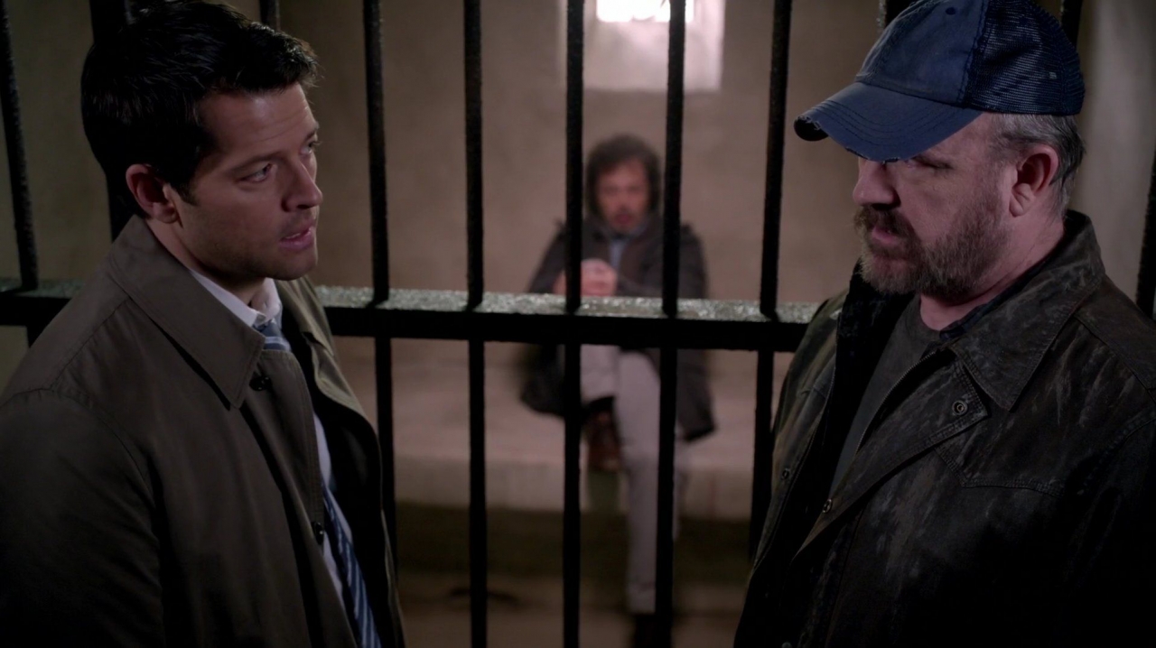
This symmetry of characters with their surroundings is repeated later in the plotline. Just as the shot of the brothers in the bunker was balanced and framed by their home, the three characters who belong in Heaven are shown together in a geometric triangle surrounded by their home. Fittingly, Metatron is situated between Castiel and a heavenly soul, perhaps symbolizing that Metatron is responsible for Castiel currently being ostracized from those who belong in Heaven. The colors in this scene return to the muted stone, tan and blue (which is traditionally seen as a peaceful color).
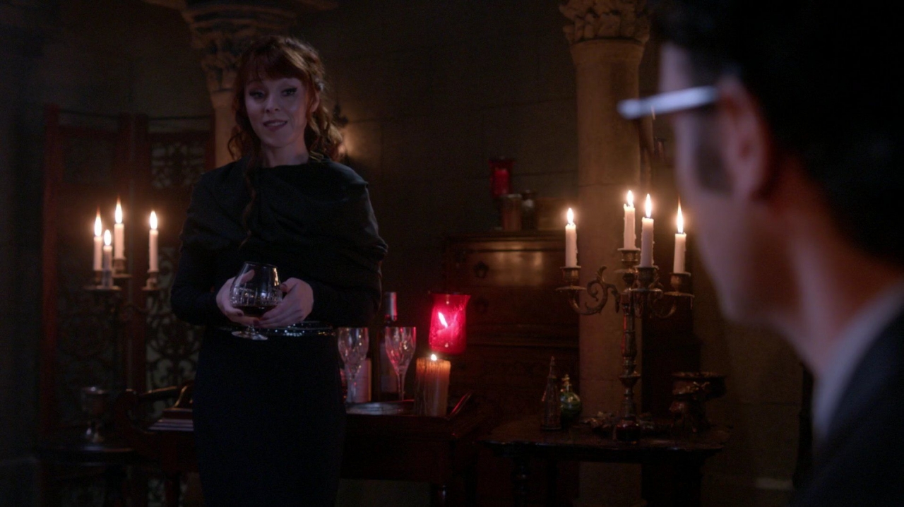
The passion of the episode returns in the scene where Rowena talks to Hell’s switchboard operator. The glowing red and yellow candles literally surround Rowena whose soul is afire with evil ambition and treachery .
The intensity of mood and color continued into the local pub, with the pitchers glowing red above yellow neon. Even Dean’s nachos were a muted shade of yellow (cream colored chips) dotted with red (peppers).
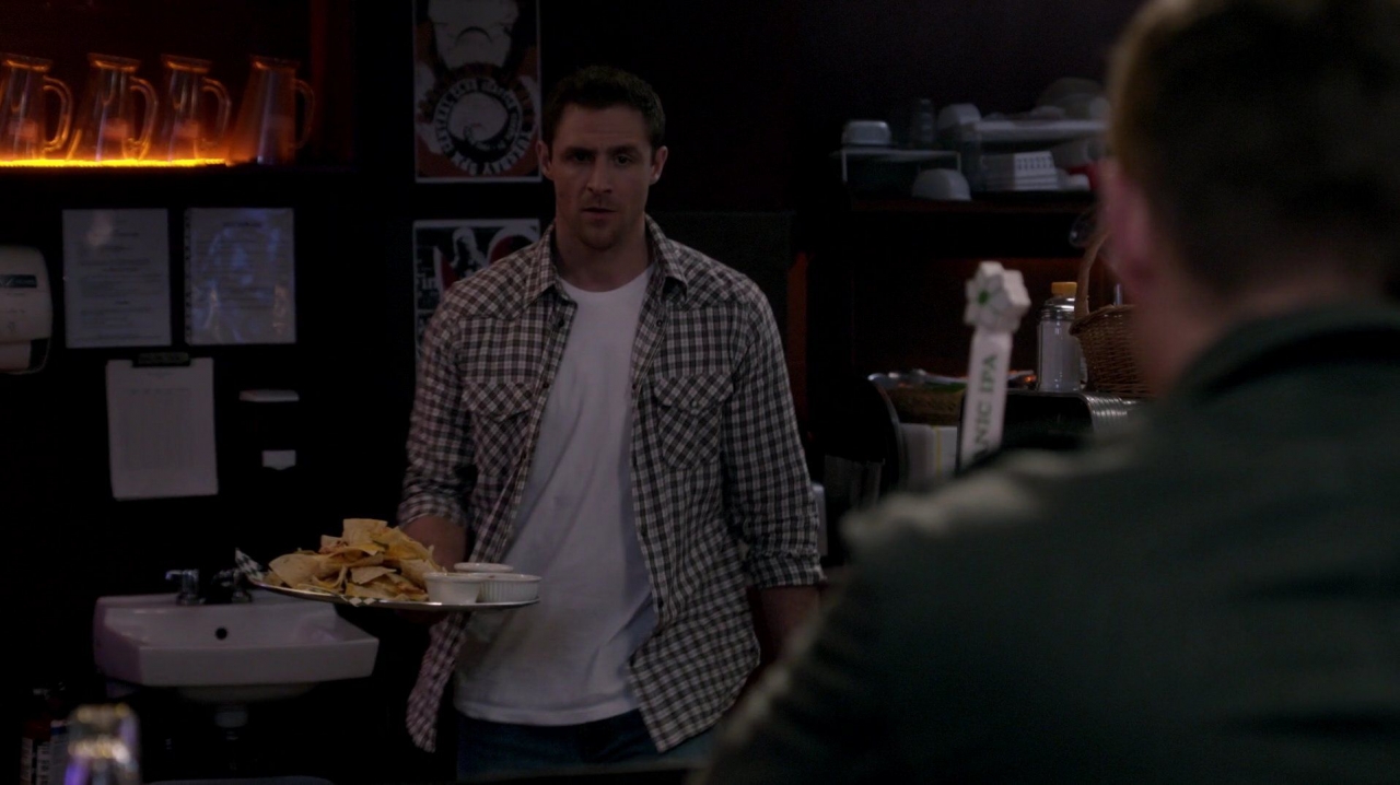
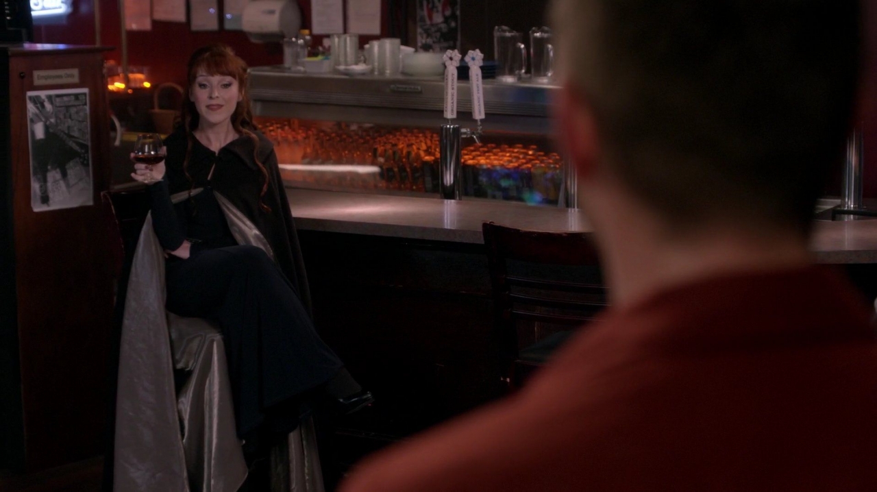
Later shots would show the bar’s yellow and red neon signs, and their glowing refrigerator case with reflections that frame both sides of Rowena in an eerie, menacing atmosphere. Notice that Rowena’s cape is lined in silky silver. This is also the first striking example of attention to detail by the set design and art departments, who created and placed the posters, papers and plates that add so much to this shot.
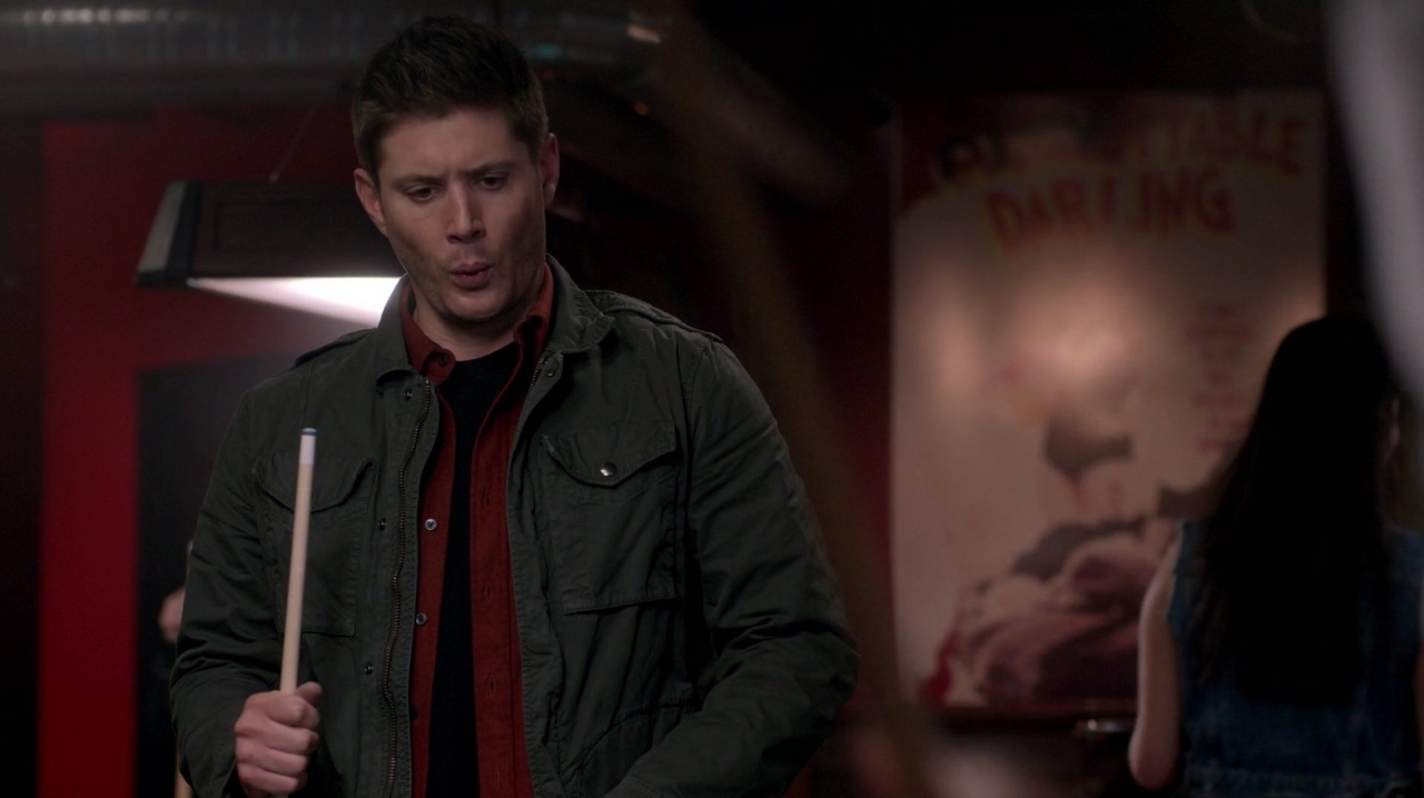
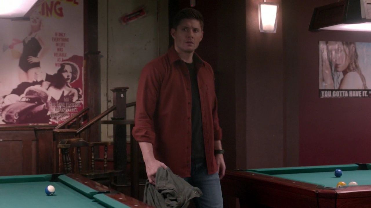
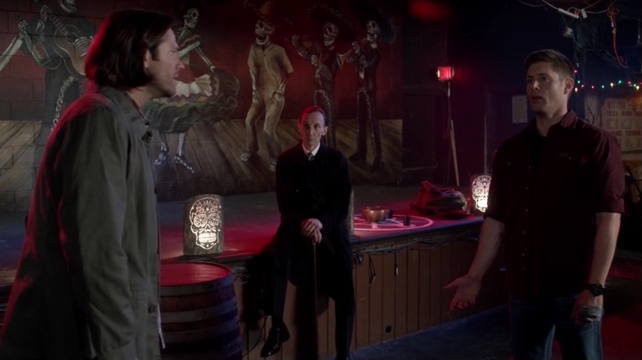
Subsequent shots of the bar’s walls and posters were bathed in the dark red of Dean’s shirt, accentuating his rage and fury. The artwork in the bar was particularly striking.
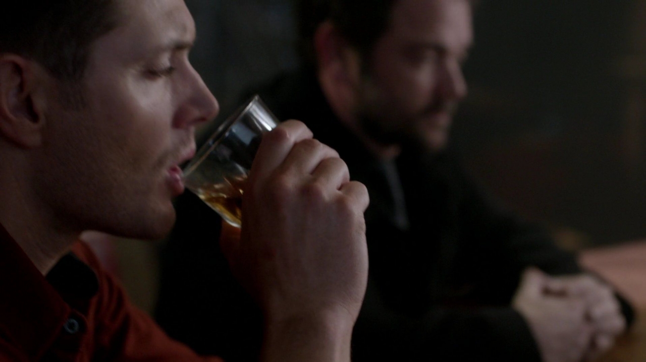
The red of Dean’s shirt and the yellow color of his whisky draw attention again to Dean, with Crowley’s muted presence blurred in black in the background.
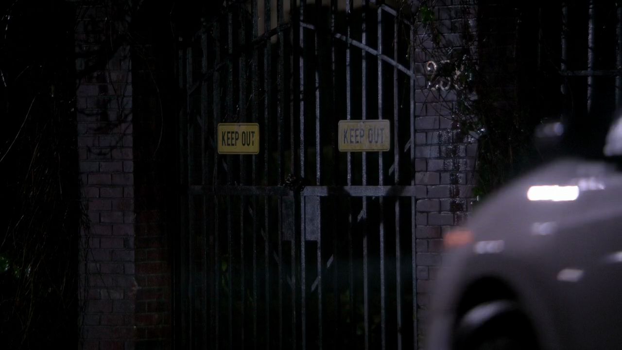
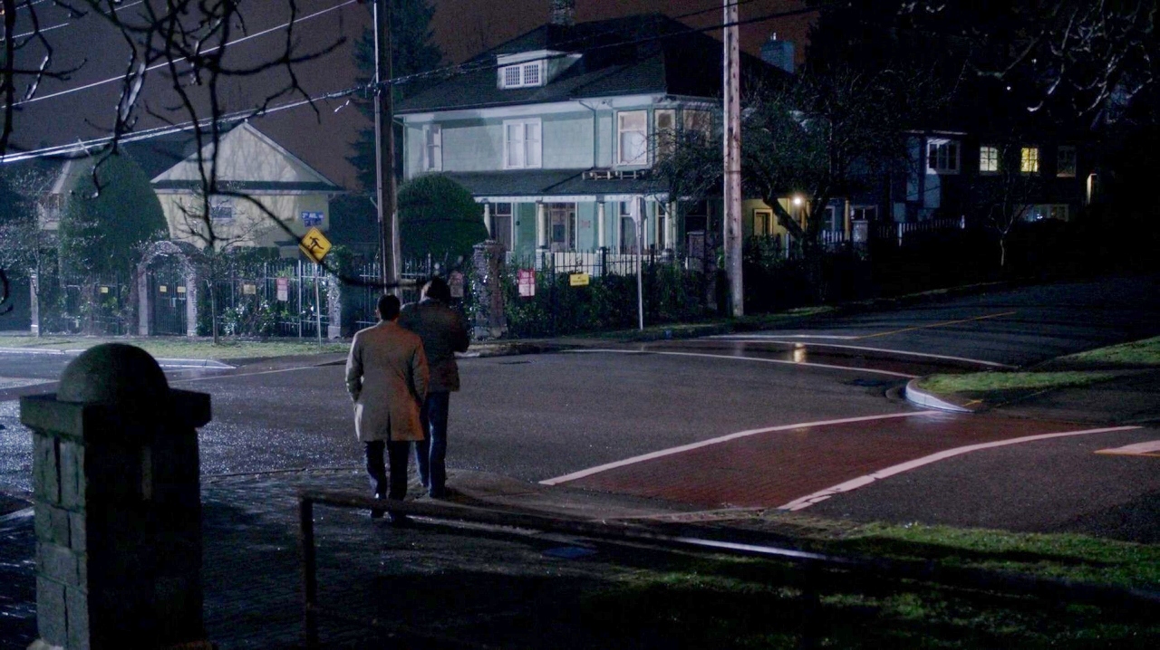
Oliver’s house is introduced with a flash of his various “No Trespassing” and “Private Property” signs, which are again yellow and red. The bars of his fencing communicate his isolation and self-inflicted imprisonment within his chosen home. Together with the pedestrian crossing sign, the menacing signs are the most prominant colors (note a touch of green grass) against the glowing grey/silver/white of Oliver’s house, illuminated by the off-camera streetlamp of night. The corner’s pillar repeats the neutral tones and stone themes.
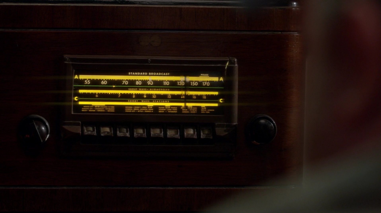
Returning to Bobby’s heavenly room, his radio now has all 3 lines glowing yellow. An indication of the strength of the psychic connection perhaps?
Bobby’s entire room is decorated in the burnt red and yellow color scheme, all the way down to his rug. The escape door pulley is a shiny silver (much more prominent later when Bobby pulls it out of the rug)
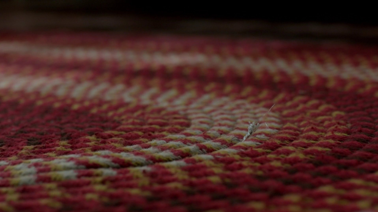
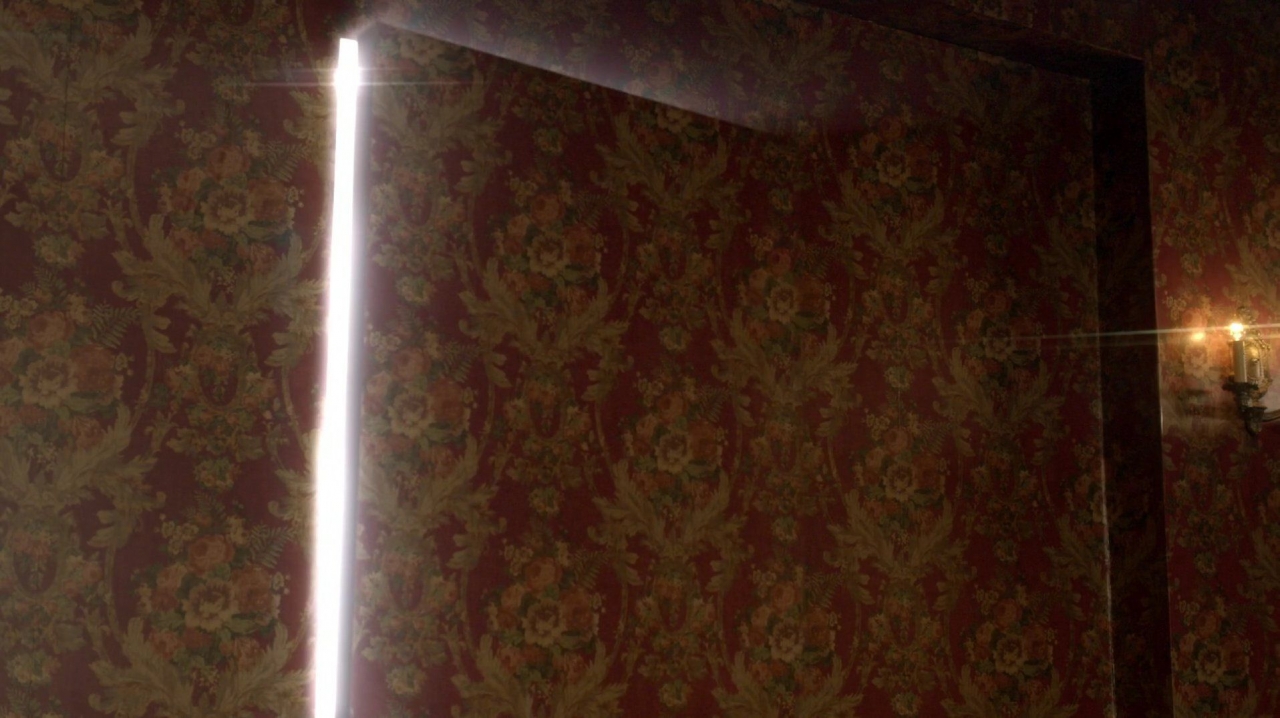
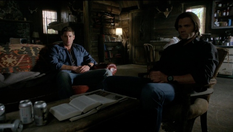
His couch, chairs, sconce candles and wallpaper are all burnt red and yellow. Their quiet, muted tone is the antithesis of passion, perhaps reflecting Bobby’s boredom, or the peace of his soul. His room’s serenity is cracked open by this wonderful shot of Heaven’s glowing light breaking into Bobby’s peaceful existence.
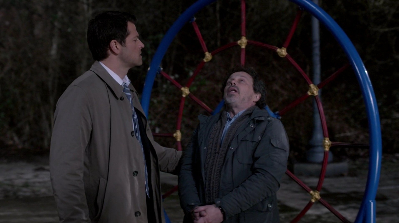
On the playground, Castiel and Metatron are framed by red, yellow and the reprise of blue, which is the literal color we see when we look toward the heavens in the sky.
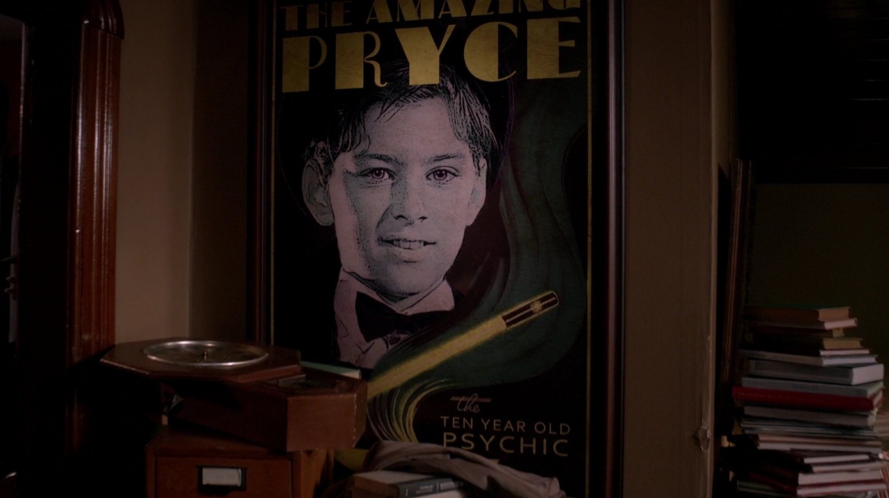
Inside Oliver’s home, his poster’s lettering is yellow, with a red book binding facing the camera. His colors are also muted, perhaps paralleling Bobby’s quieter years. The “light”, passion and excitement have gone out of both of their lives, with a broken clock symbolizing how time has stood still for Oliver.
Although always outstanding, the set designs of many episodes are background only, supporting the characters, plot, themes or action. In this episode, however, they were a character onto themselves. The camera panned and lingerd on Sam bedroom in the bunker, giving us the first, detailed look at his belongings. (We saw his room when he, Charlie and Dean watched a movie in there, but I remember it being rather sparsely decorated at the time. Am I wrong on this? Had we previously been given such a long time to absorb Sam’s space?)
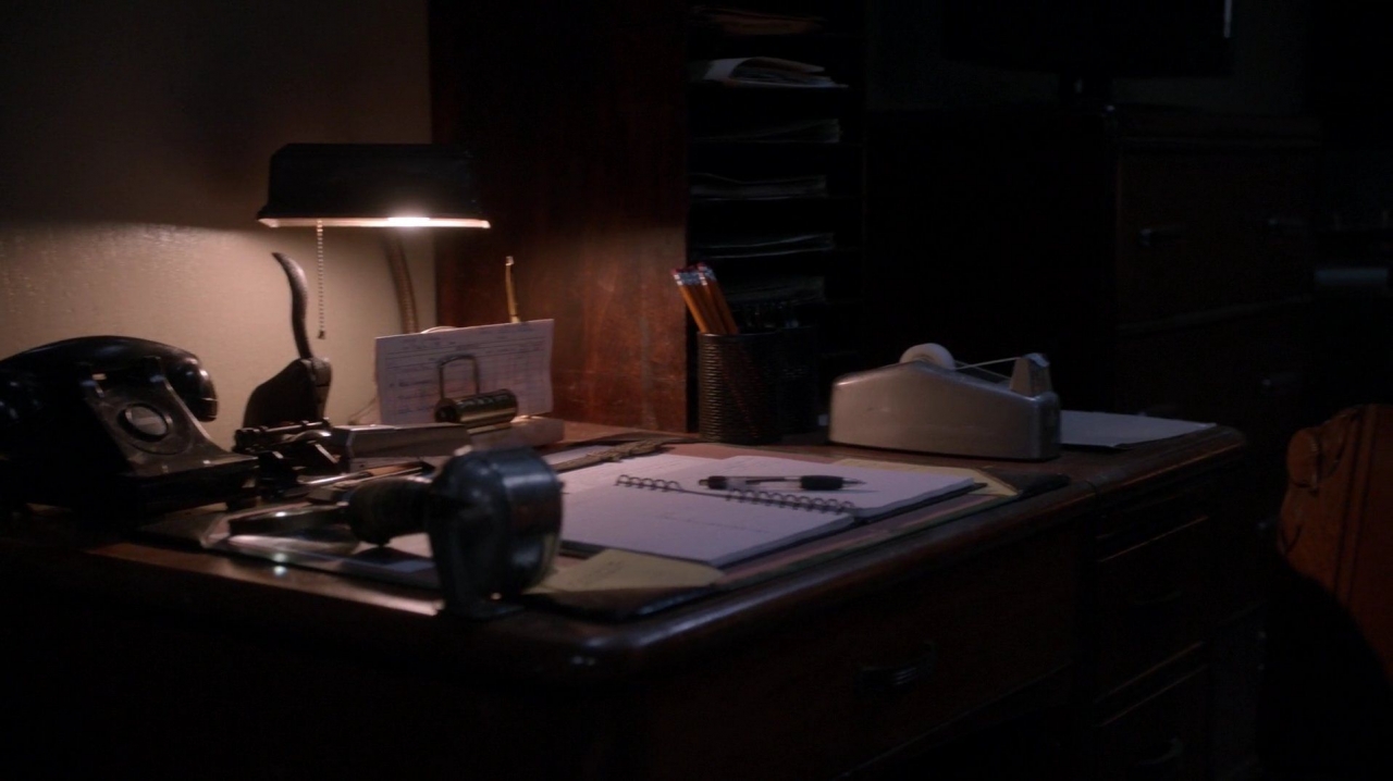
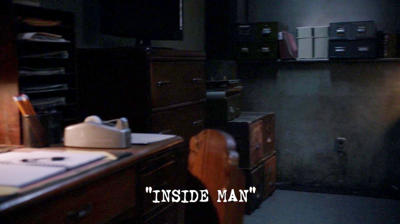
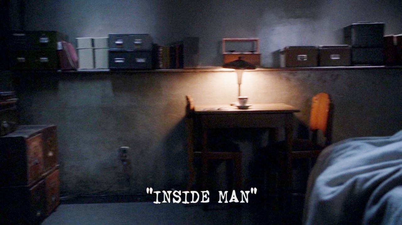
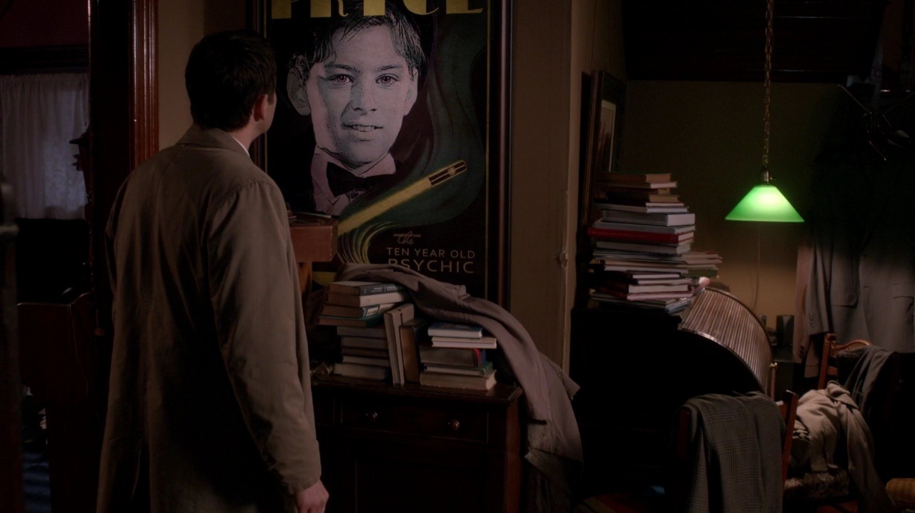
Castiel’s slow scan of Oliver’s home let the story linger on Oliver’s character, lifestyle and history without dragging down the story with exposition. The variation of having a green lamp is interesting. Any thoughts on the color’s meaning here?
Bobby’s heavenly space also had a fair amount of detail, replaing the home that was a bedrock of the show for so many years. Given its familiarity, due respect had to be paid to Bobby’s new surroundings.
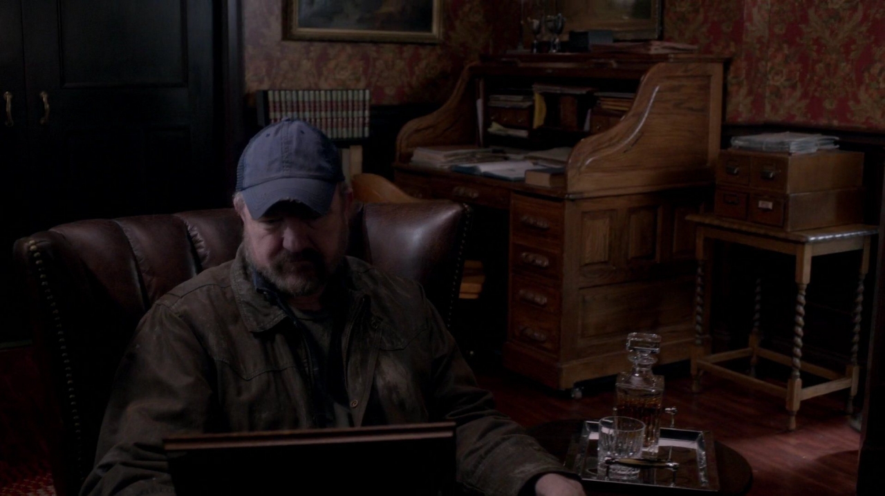
Bobby’s room and the adjoining hallway also defined Supernatural’s Heaven. Prior seasons have portrayed individual spaces, such as living and dining rooms, homes, cabins, roads, conservatories, office space, Ash’s bar, a park for flying a kite and a jail, but significantly this episode creates the infrastructure of Heaven, the connection between so many individual “heavens”.
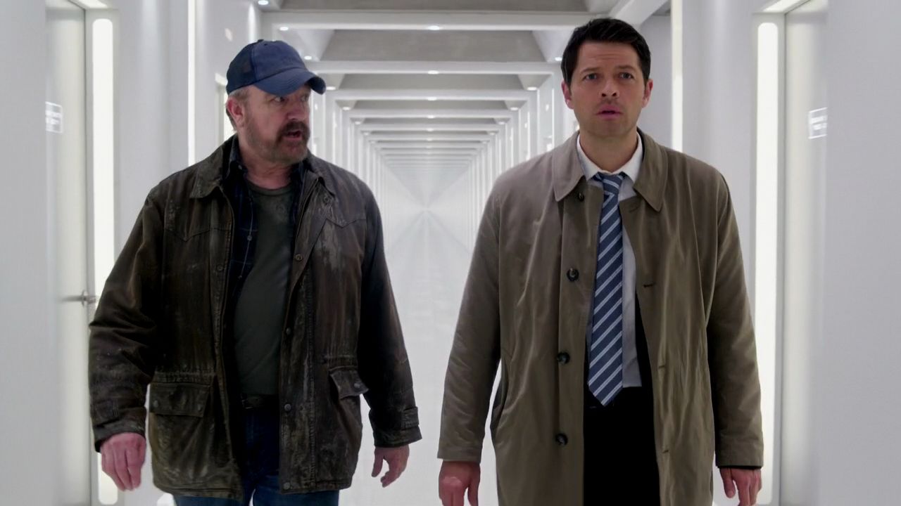
This shot glows with Heaven’s infinite grey/white corridor, which is pristine, yet somehow impersonal and lonely. Interestingly, this perspective is duplicated at the end of the episode when Rowena is walking her endless, lonely path (see Best Shots, below).
The bar also seemed more detailed than usual. Posters (probably created by the Art Department) reflect the mark’s unbridled passion (“You Gotta Have It”) and how Dean has lost control of his life “(If only everything in life was reliable as a woman”). [Let me know if your larger computer screen or stronger glasses read something different on those posters!]
The scenes discussed above only skim the surface of the many shots that add so much to the depth of this episode. As is my custom for Visual Reviews, though, I would like to honor what I consider to be the episode’s 15 best or most memorable cinematic shots. Just like artistic masterpieces, I also title each shot for they deserve a name that captures their meaning.
Honorable Mention:
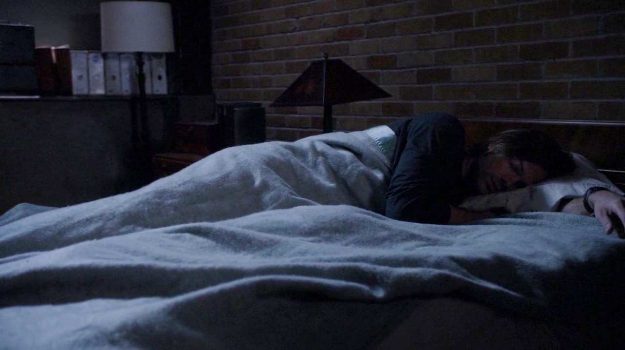
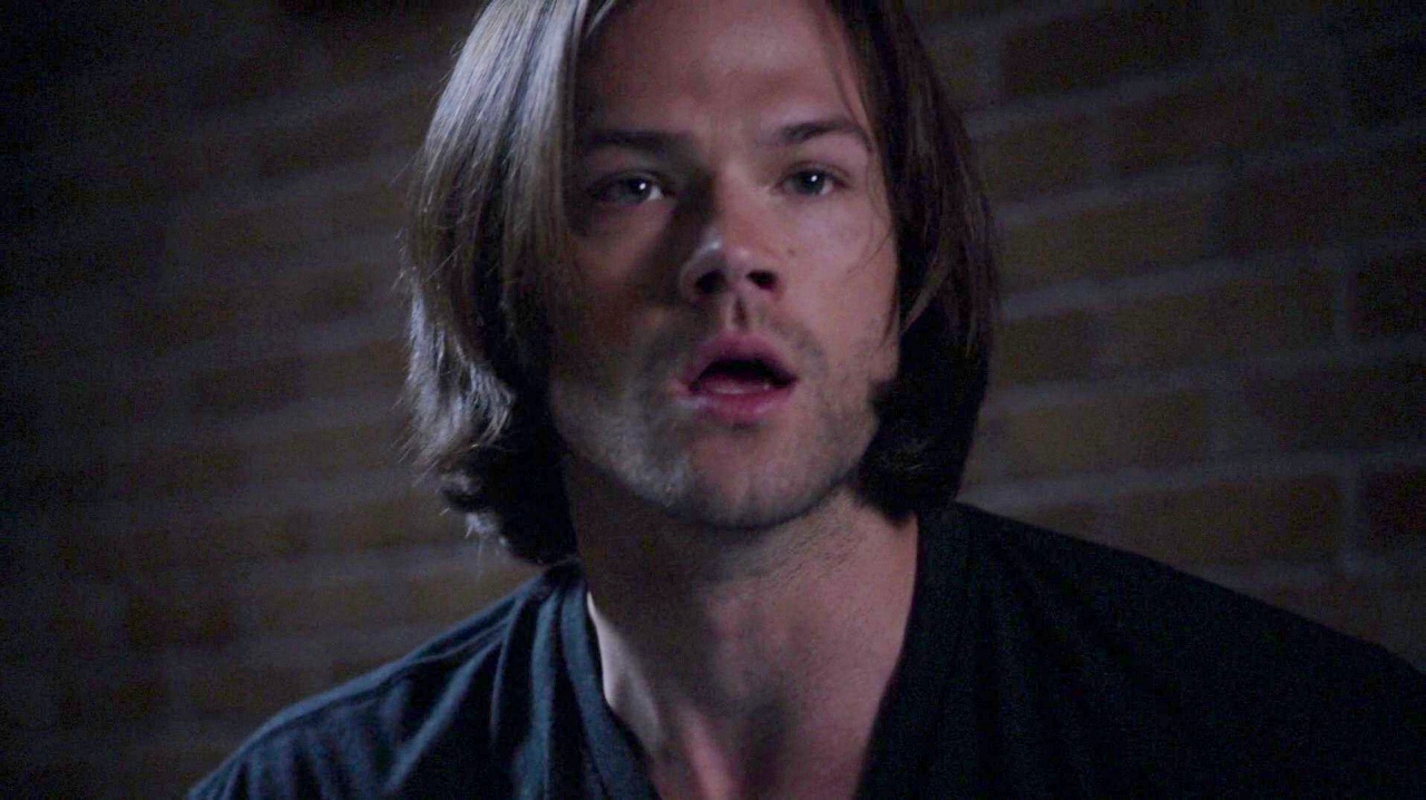
Sam sleeps with 2 lights lit and with his watch on. His right hand under his pillow, presumably holding his gun.…and he wakes with every hair on his head in the right place. Did the hair stylist tell Jared to not move around on his pillow lest he mess his hair?
#15
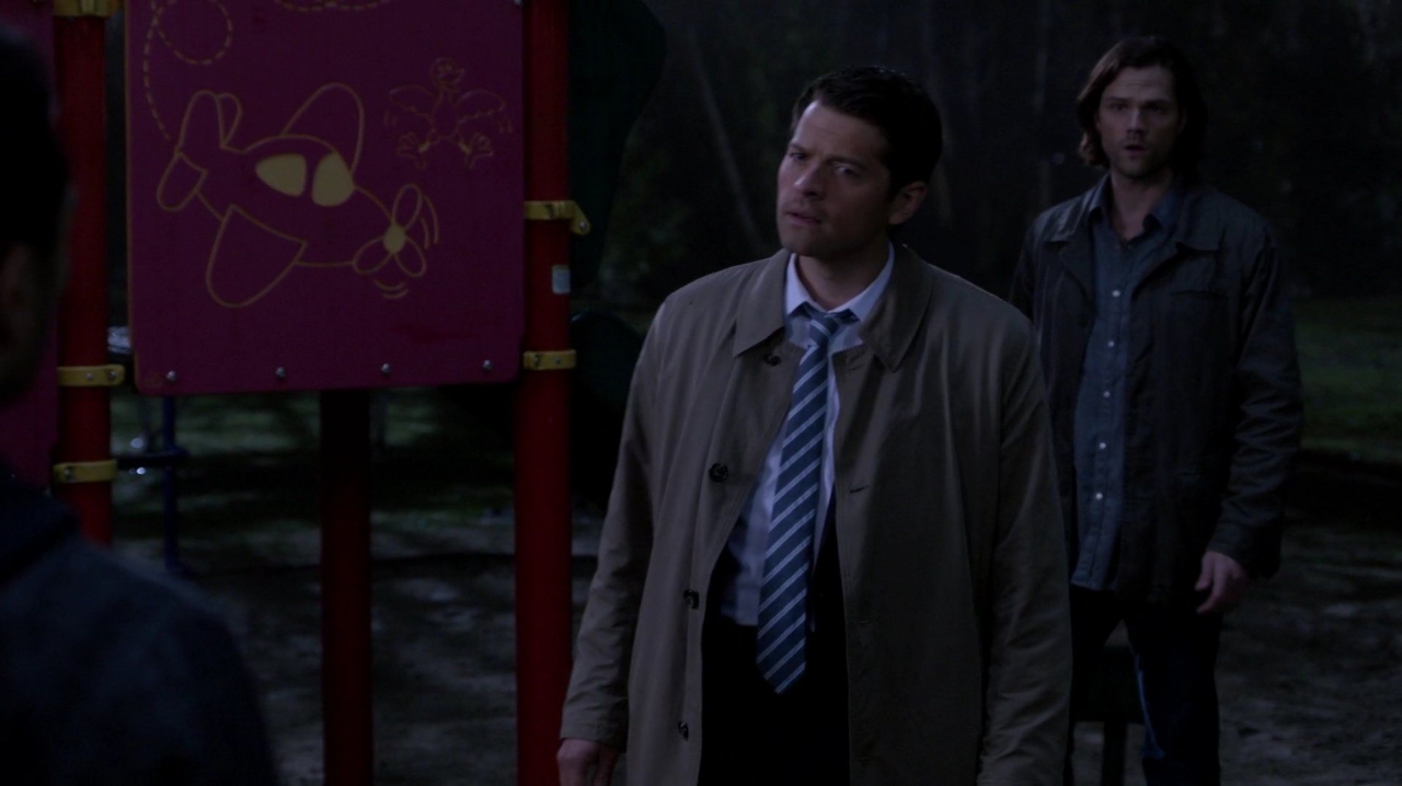 “On A Wing and a Prayer”
It is ironic that Castiel is framed by playground equipment that shows a bird frantically flapping its wings to try to get out of the way of man’s attempt at flight. The suggestion that man is encroaching on the natural order by having planes push one of God’s winged creations out of the skies is an interesting metaphor of Heaven and the angels’ struggle with human’s strength of will. [Does anyone recognize this title? I thought it was particularly fitting for Castiel!]
#14
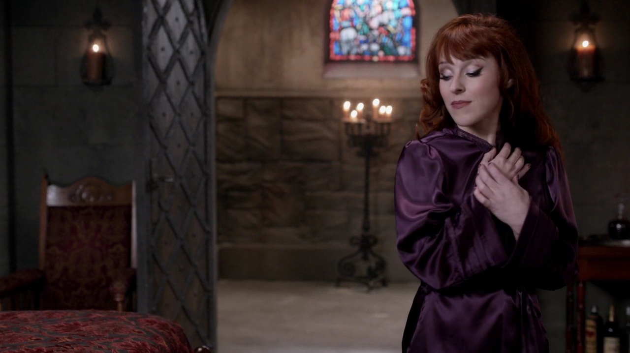
“The Queen Mother”
Rowena’s robe is silken purple, one of the colors of royalty, again suggesting how she views herself. Her mannerisms framed by the royal chamber door, ornate briqued chair, candleobera and steined glass window all suggest a queen in her castle. (As an aside, her makeup in this episode was flawless and striking. I thought she looked particularly young and beautiful).
#13
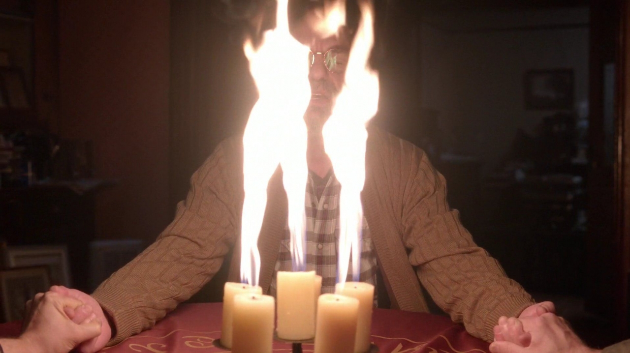 “Playing with Fire”
Once again Sam and Castiel use a medium to speak to the beloved departed. The power of touching the afterlife pictorally and symbolically overpowers Oliver (remember how this worked out for Pamela?).
#12
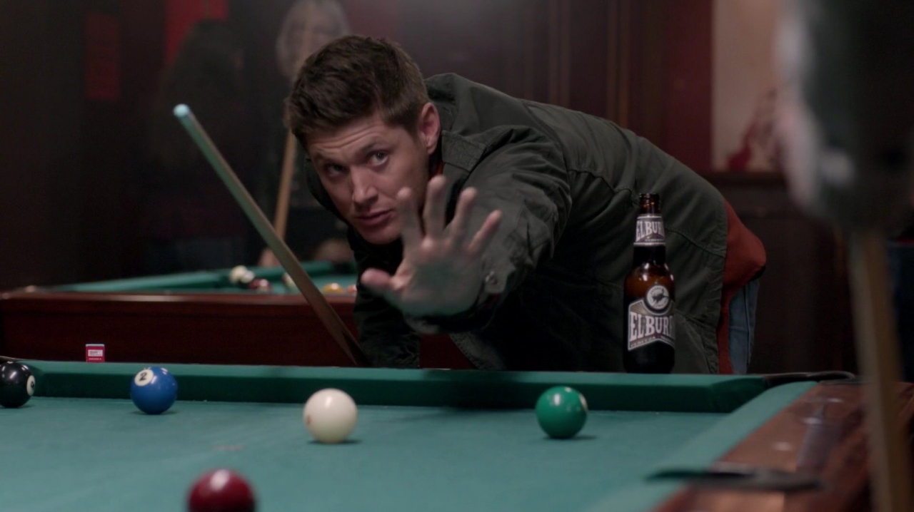
Just as in “The Things We Left Behind”, pool tables and the surrounding bars were used to establish mood and reinforce color schemes. The shot of the racked balls before they are dispersed is a kaleidoscope of the episode’s colors: burnt red, black, white, blue and the background green. Dean’s gesture says so much about the power and control Dean has over the situation and the unsuspecting college boys.
#11

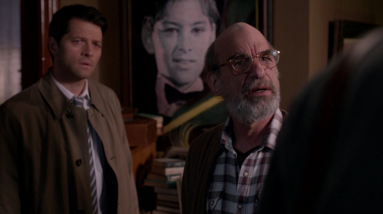
A wealth of back story is provided in just one shot inside Oliver’s home. The framed poster of his past, the clock, strewn clothing and stacks of books, introduce a surrogate Bobby. Oliver’s home shares a lot of the same qualities as Bobby’s Heaven, perhaps strengthening the parallel between the two older sources of background knowledge consulted by the brothers.
As an aside, with Pamela dead, I’m hoping we’ll see Oliver again. He was a interesting, snarky, multi-faceted character who already has a history with the MoL. His short time in the story was packed with hilarious, memorable lines (“You can’t be. I’m an atheist”; “Hippie over there”; “You? I’m only getting colors from you”). The effort that the set design and props department put into his short appearance seems to hint at a bigger plan for him. With Bobby gone, there’s an opening for an older, wiser man who isn’t afraid to put the boys, or Castiel, in their place!
# 10
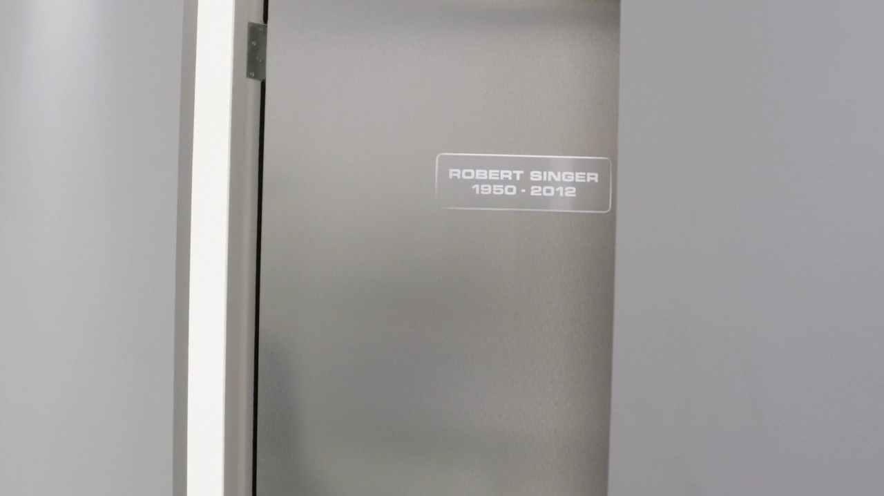
The idea of Bobby having his name immortalized on a door in Heaven just had to be captured.
#9
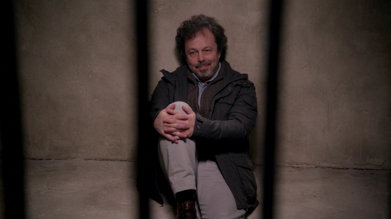
A shot of silvers, greys and blacks, Metatron is surrounded by stone and his jail cell bars. His smug, confident, defiant scheming is contained, at least for a few more moments.
#8
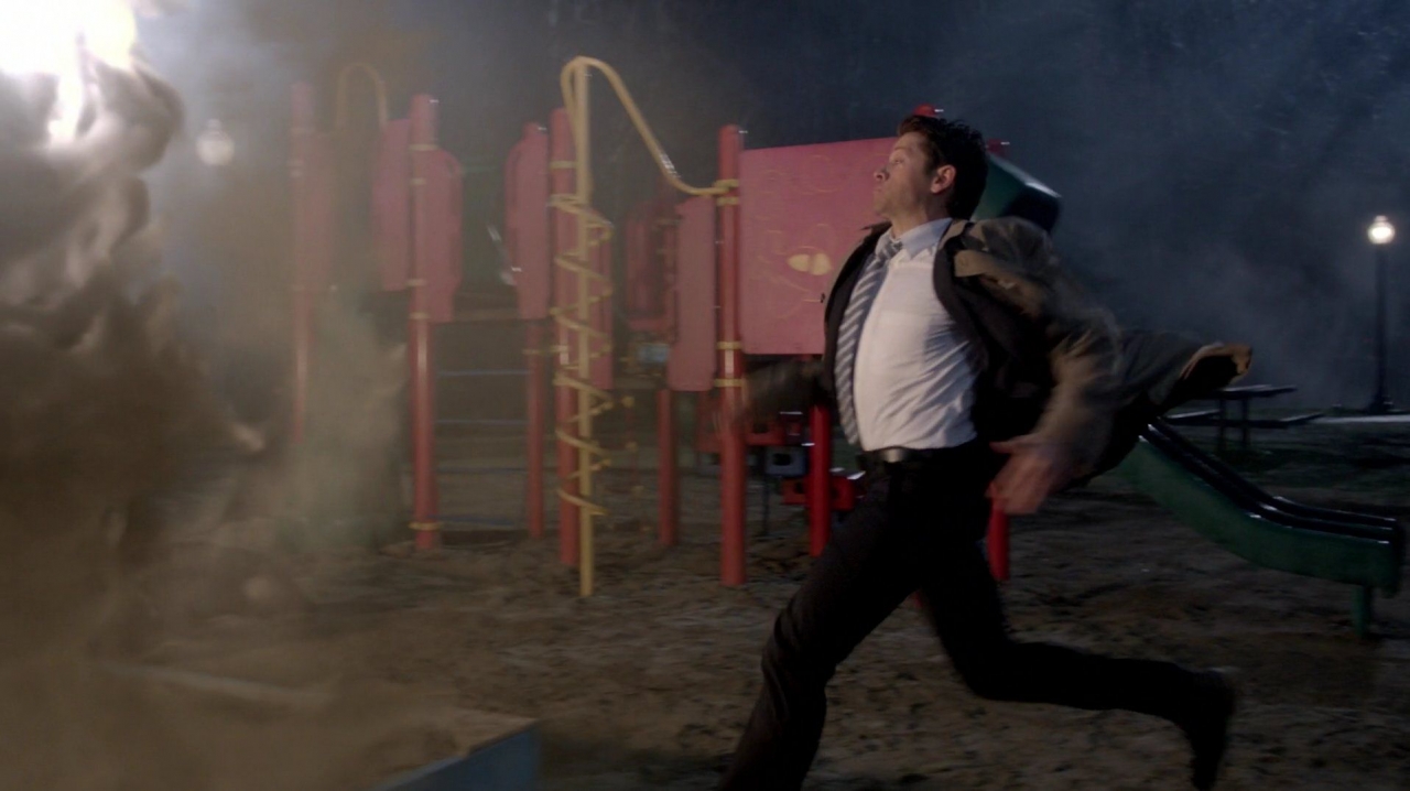
“Run, Cas, Run!”
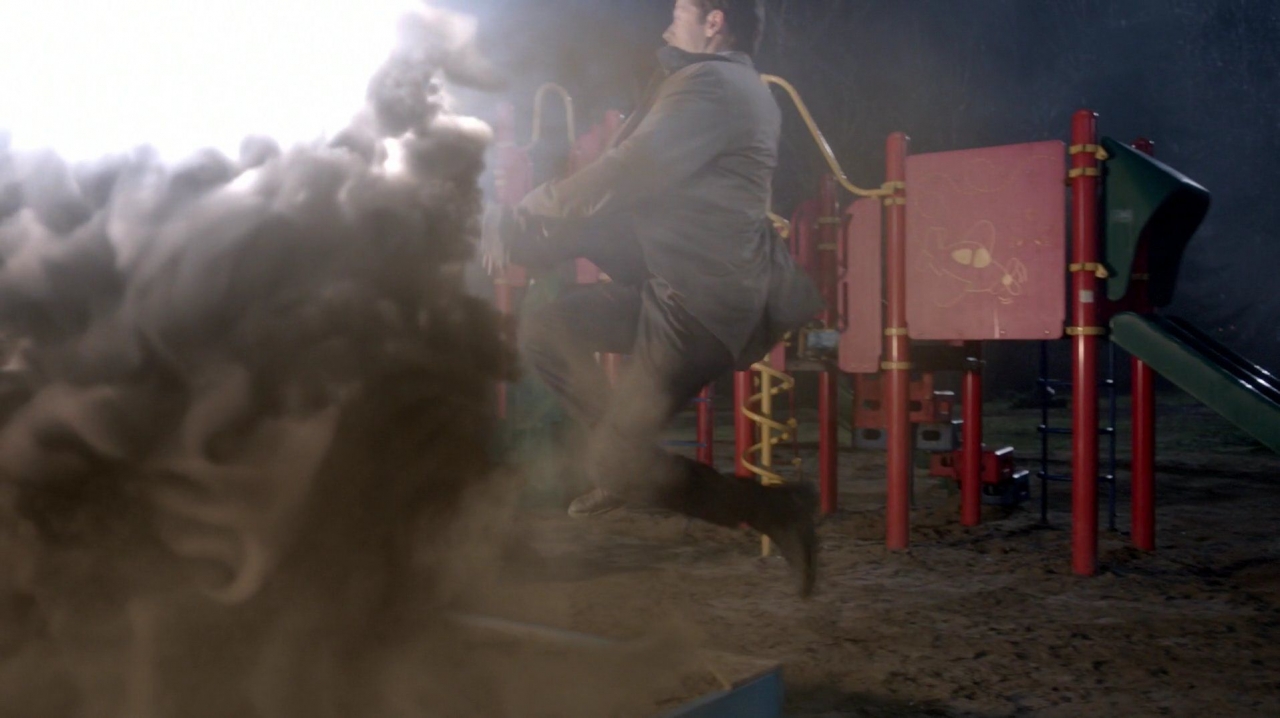
“Look! I’m Doing My Own Stunts!”
The red and yellow playground provides a colorful background to Castiel’s action-hero moment. You have to love that they did his jump in slow motion!
#7
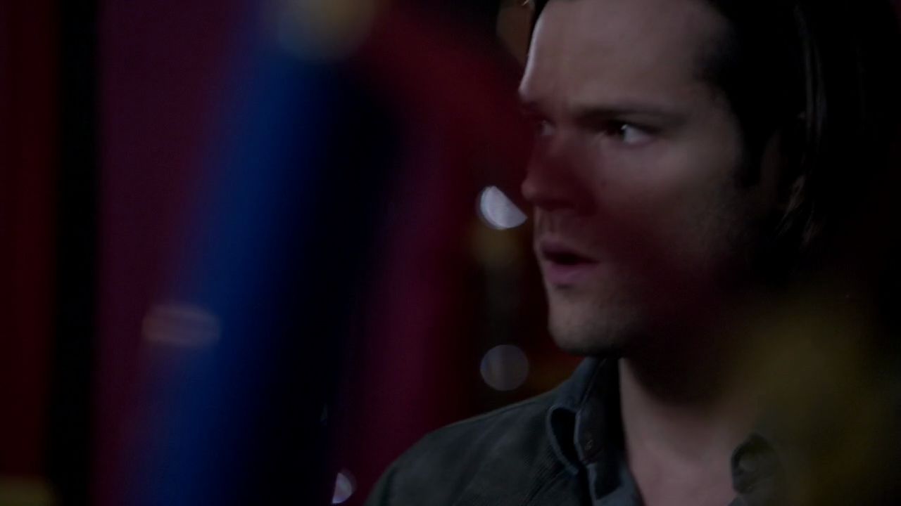
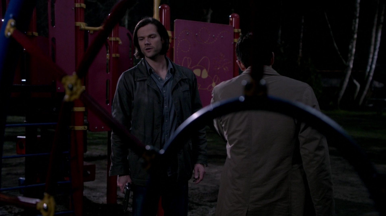
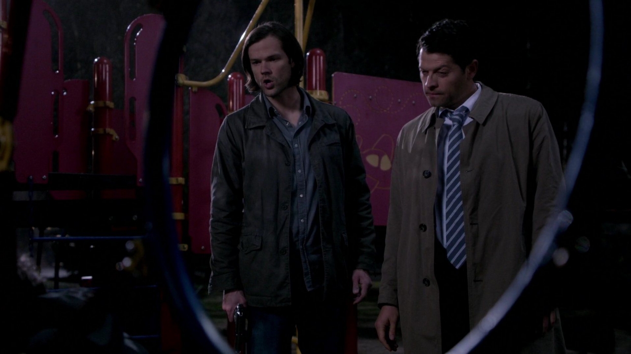
Again, the first shot of Sam is partially blocked, this time by playgound equipment, nicely portraying that his actions, influence and power over both the situation with the Mark and the situation with Metatron are blocked at every turn. The colors and structures of the playgound are then used to frame, center and highlight our heroes.
#6
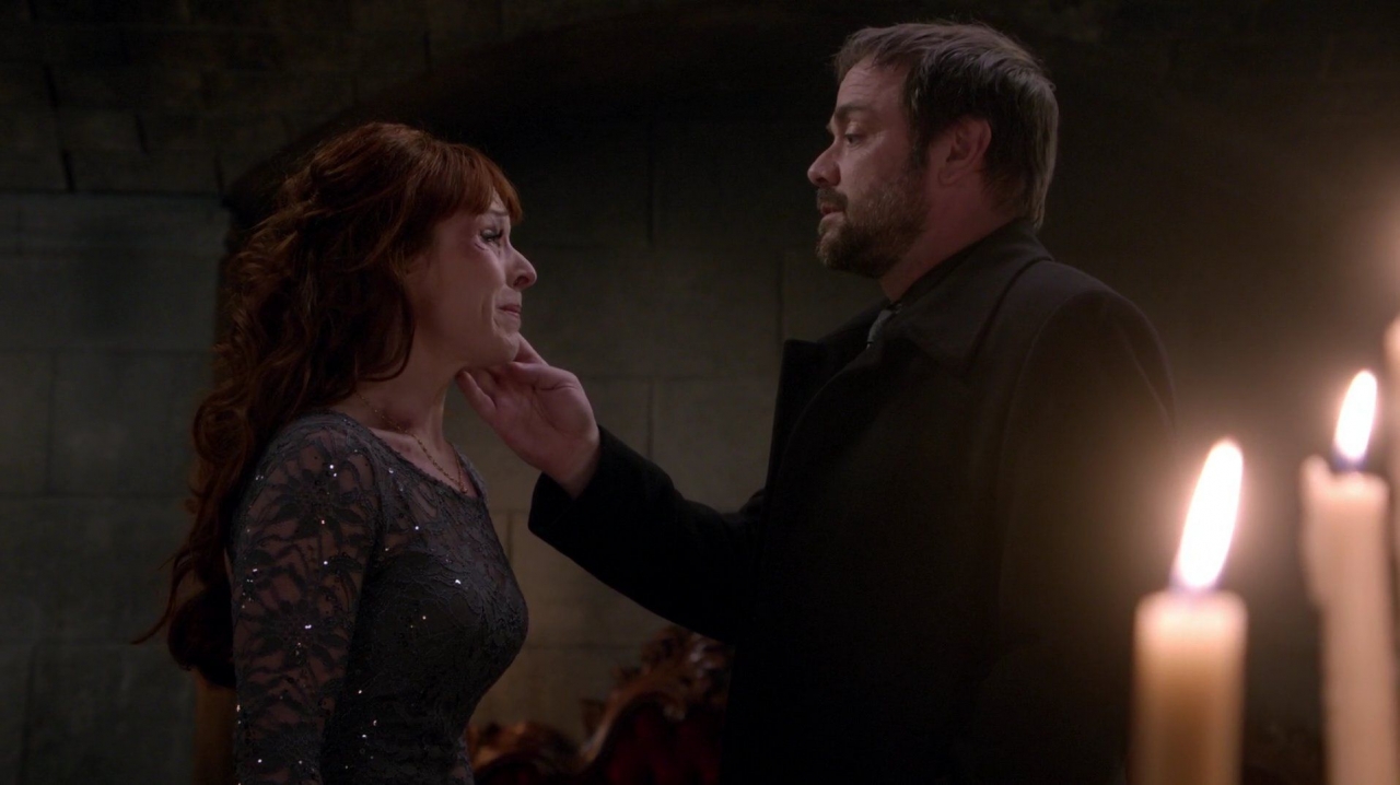
The flames, lighting and colors (grey and stone) set the mood for Mark’s and Ruth’s superb acting in this climactic scene where Crowley breaks ties with his past, and makes an enemy of his mother.
#5
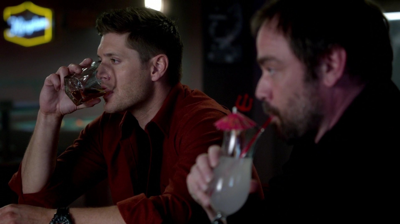
The two hard core embattled soldiers sharing drinks and learning truths from each other is going to be timeless, classic scene of the Supernatural series.
#4
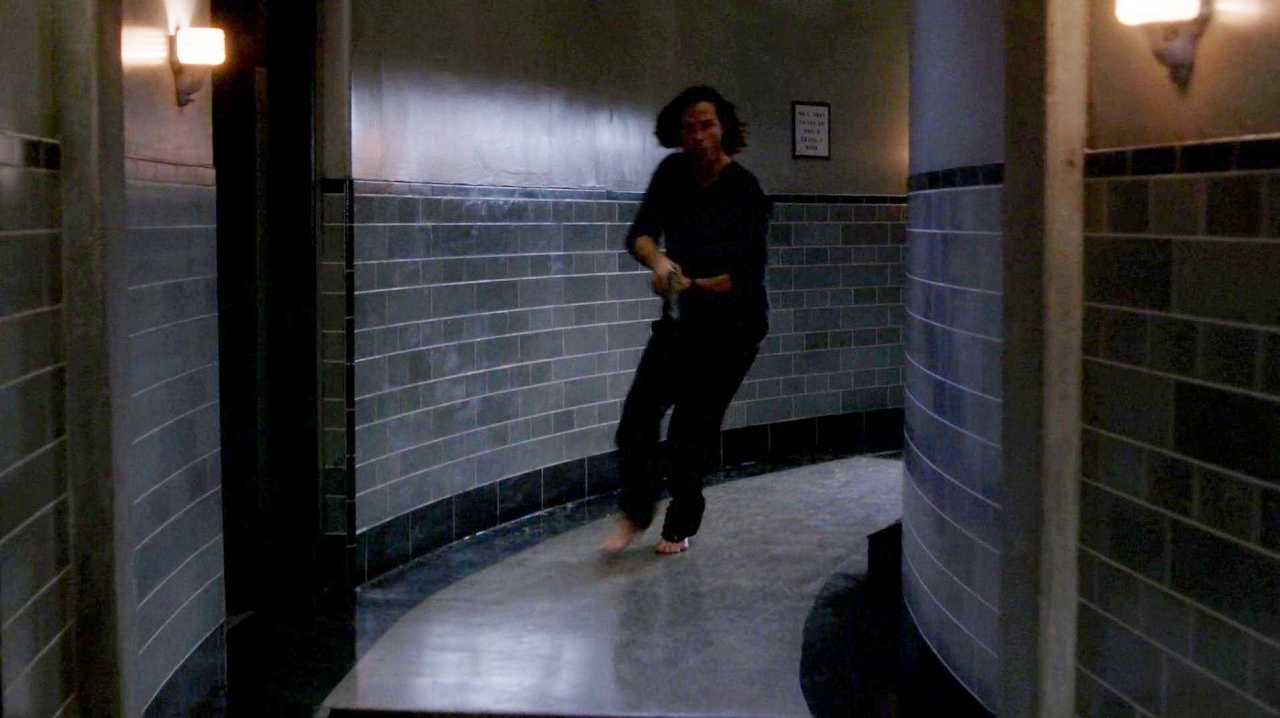
The light glowing off the rounded wall and floor, Sam’s body slanted and hair flying as he runs in a panic down the empty, cold hallway with bare feet, plus sconce nightlights reflecting a yellowish tint all evoke an eerie feeling of foreboding. An excellent view of a hunter’s hyper-vigilence and loneliness, even in his own home.
#3
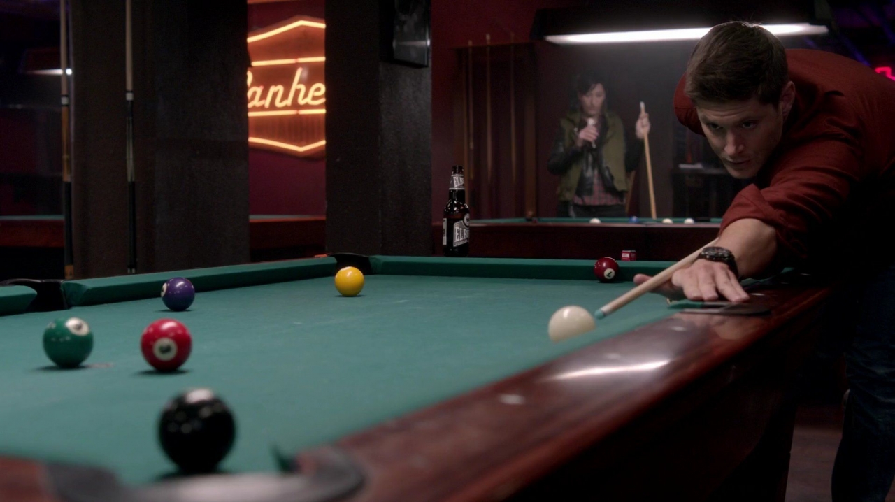
The bright red, yellow, burnt red, purple, black, white and even green billard balls plus the neon sign pull together all the colors that characterized this episode. Dean’s long line is extended by the edge of the pool table, which reaches straight through the camera into our homes. The flurescent light over Dean’s head calls the eyes’ attention to him. The tall beer bottle compliments the tall beams. This shot is all about angles, color and light. It is a visual delight.
#2
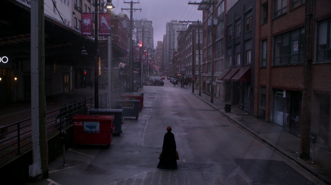
Rowena is put out with the trash. The grey road ahead is long and loney, with grey skies above and grey prospects ahead (cold, anonymous apartment buildings). The only color in the shot is red, highlighting the trash bins, the signs symbolizing that her heart was stepped on, and the lights that pull our eyes to the distant perspective of the shot. A superb standalone scene.
#1
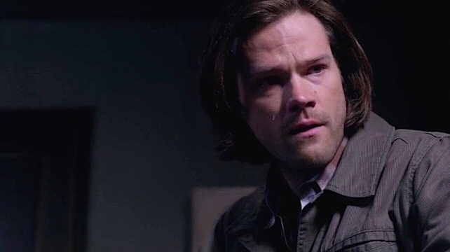
We miss Bobby too.
Even with nearly 50 shots, I haven’t nearly covered all the great visuals of this episode. Please share your insights on the colors and any favorites scenes I missed. Plus, check out Wednesday’s cinematography insights in her review of 10.17 (coming soon). She has some great additional observations, plus a gif. of Castiel’s jump!!
Credits confirmed with www.TV.com
Screenshots courtesy of www.kissthemgoodbye.net and www.screencapped.net

Nightsky, I have to admit that I am not that observant about the visuals and cinematography of the show. At times I will be struck by the extreme beauty or striking visuals of a scene, but I’m usually focused on the characters and dialogue and don’t pay as much attention to these other aspects. That being said, now I wonder if I am at least subliminally aware of the amazing visuals that you have beautifully pointed out. Because “Inside Man” was one of my favorite episodes not just of this season, but of the past few years, and I think the atmosphere created by the visuals is part of why I absolutely loved this episode. So many scenes stayed with me for weeks after it aired, and I felt compelled to re-watch it several times. I felt that almost every scene was perfection, and there are not that many episodes that elicit that reaction in me. So thank you for highlighting some of the outstanding artistry displayed in this episode. It makes me determined to be more appreciative of the cinematography in S11.
Sometimes I am really struck by the visual presentation of an episode. This was one of those times. I’m not sure if the goal is to become aware of the symbolism of sets, colors, etc. as we are watching the show, or to have them, as you said, subliminally communicate moods, ideas, themes.
I really appreciate your feedback. I suggest that you also read the cinematography portion of Wed’s RearViewReview, posted today. She has some excellent observations. I don’t know when or if she’ll add her thoughts about the color green (I encouraged her to amend them to the article in comments) but I think she came up with a fabulous insight on its addition to the color palette.
Very Informative! Thanks for all the hard work you put into this. One thing I did notice that caught my eye but didn’t make much sense.. Considering Crowleys current throne room appears to be in some type of factory/possible office building – doesn’t Rowenas room look like it would be more fitting in a Game of Thrones episode? The wall, the ornate door, the Tiffany window? Maybe she just cast a spell… the Queen Mom deserves proper surroundings after all. And what’s with all the candles for Pete’s sake? Isn’t Crowley aware of the strain that can put on someones eyes? How’s Rowena supposed to complete her needlework? I mean if the MOL bunker can have running hot, cold and electricity… If he would stop mooning over Dean for five seconds maybe he would get Hell Part Deux in order.
Loved the bunker shot of Sam’s room. For the most part I think at this point he has accepted it as home, but his room looks more like a library/office filing system than any kind of relaxing personal space. Where’s the enjoyment? Dean’s got his memory bed, his music, his personal items (although they are no longer hanging on the walls), his porn. I didn’t even see any clothes thrown about or strewn on the floor… C’mon younger Winchester, lighten up. At least get a memory foam pillow… you’ll love it, I promise!! 😉
Thank you very much for commenting!
The whole Hell-above-ground space doesn’t make any sense. They just found this gigantic warehouse and decorated it with candleabras, stained glass and thrones? I certainly understand Crowley not wanting to be in Hell, but the warehouse space is a major failure to me. It ranks right up there with the Leviathan VX as something that drags down the overall quality and believability of the show. It’s embarrassing. The writers needed to at least explain it.
Regarding Sam’s room, in a way I understand his decor. Organization is his relaxation. After being around Dean’s chaotic, loud energy all day long, Sam needs quiet, uncomplicated, organized space to get his mind settled. Can anyone think of us being told of Sam’s hobbies? Mass murderer statistics (i.e. “Real Crime”) doesn’t have bedding accessories at Target! Really…what are his hobbies?
I noticed that there was a striking color theme going on when they showed us Bobby’s radio… the colors were so intense that I was like “oh, they are playing with yellow and red!” I don’t always notice these things, which is why I really like your visual reviews. I agree with SandD… this episode was stellar, the best of the season, the best of the Carver era perhaps. Kudos to Mr. Dabb, he can really come through when he puts his mind to it. Sometimes I wonder about the visuals. How come the best written episodes work the best visually? Is it just that great writing creates more interesting ideas? It’s more fertile ground, so to speak? I wonder who is responsible for the lion’s share of these kinds of details? Is it the director? Is it the brilliant Serge Ledouceur reading the script and developing a color story? Does the writer indicate that he’d like this little touch or that little touch? Is it costuming? or Sets? Is it a little bit of everyone? I am quite curious about this side of things when it comes to creating an episodes. Who else would LOVE to see a panel at a con with Serge? I would, I think it would be SOOOO interesting!
E.
I was thinking the same thing. How much fun would it be to have a panel with the set designers for this show at a convention.
Thank you Nightsky that was a wonderful read. I don’t always get the visual references during a live watch but since reading your wonderful articles I have tried to pay closer attention during a re watch. I still don’t get half the visuals that you do. Really great article.
you’re welcome!
I’m amazed when I read Wednesday’s visual review notes because she always picks up at least one thing I missed, and visa versa. There is just so much to see!
[quote]I wonder who is responsible for the lion’s share of these kinds of details?[/quote]
I asked this question somewhere…I think it was a tweet to Jerry Wanek (set design). The answer was that it is a collaboration. They all get together and work out the color scheme, setting, costuming, lighting. I’m not sure if the Director is on set yet or not. I would think that he/she is since the director conceives the overall look of the episode. Writers specify setting (e.g. Bobby’s room is Heaven was probably described in the script) but the director has a lot of latitude in angles (highlighted in Wednesday’s review’s cinematography section), distance to subject (close up vs wide shot) etc.
I loved the writer/producer panel at last years VanCon. I am very excited that Robert Singer is coming to ChiCon this year!
Don’t have much to say except that your article made me watch Inside Man again. I really am amazed how people can see all these visual parts from the episodes, but I am glad they do. Everything was great in this episode and even more than I thought. There was many masterpieces in this season and this episode was one of them.
I wish I had time to do more Visual Reviews! Reichenbach was another visually complex episode. Thank you for reading!
I hope we will get many more of these for you to review in season 11. My graphical interest is for everything around me so also your visual review is always delight for me. I don’t focus on the visuals while I am watching episodes but for some you notice if everything fits and visuals are part of that. Can’t wait for more.
– Lilah