

Supernatural Quilting Bee: Sam and Dean’s Initials

One of the biggest dilemmas we fans may face when going to a Supernatural Convention is what we want to have signed—if we are lucky enough to have autograph tickets, that is. There’s many posters and photos available to buy. You can choose to have your DVD/Blu Ray box sets signed. You can have other merchandise like calendars or t-shirts signed. Anything a fan chooses makes it special to them, but sometimes fans want something much more unique to have signed. I found myself feeling that way last year at VanCon when I ended up getting a poster with the boys and the car. Oh sure, I love that poster, but now I want something much more unique to have signed—something that fundamentally symbolizes me as a fan.
I’ve noticed that fans in the Supernatural Family—or any fandom really—are a really talented and creative lot. For those who want something unique, there’s a project or craft that can fill the gap. Some draw incredible studies of characters or scenes. Some write fanfiction or meta articles. Some make stunning replicas of various objects seen on the show. Some fans craft dolls or make jewelry. However a fan does it, the end result is an unique expression of their love for the show. These things are the best things to have signed. It makes the experience so much more personal and memorable—for everyone involved. And so, I started to think about how I best wanted to do that for the future cons I planned on attending.
Generally, when I watch TV, I like to keep my hands occupied. I embroider through everything I watch—save new Supernatural, of course. I’ve stitched several stamped pillow cases for instance, but I found that I wanted to design my own patterns. I liked the challenge of it and the idea that the final product would be truly one of a kind. And so, I started to look towards Supernatural for inspiration. Symbols are everywhere in the show—from the Devil’s Trap to the Angel sigils to the MOL Logo. Each symbol is distinct and recognizable for the fans each time they’re shown. Due to the visual nature of television, there’s so many of these symbols to spot and see. And they’re the very symbols I want to use for my own patterns.
I’ve started a Supernatural themed quilt with each square embroidered with some symbol from the show. So far, I have about twelve squares planned. I will have red, white, and black squares. I’m starting with the black ones first. The black ones I have planned so far are: a Devil’s Trap, a Mark of Cain, and Sam and Dean’s initials from “Swan Song.”
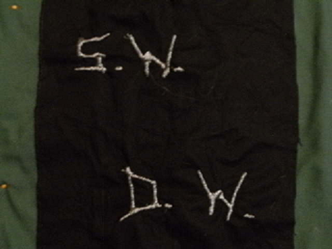
Yes, those initials—the ones the boys carved into Baby long, long ago. It’s also the center square for my quilt. I needed a square that represented the brothers. Since I chose silver on black, it also captures the Impala’s beautiful black paint and chrome. I get the big three characters of the show all in one go with this square that way. How else would I center a quilt like this? Sam, Dean, and Baby. There’s no other way to do it.
I’ll tell you how I went about doing it—and show you step by step what I did.
First, let’s look at the supplies needed:
Plain black fabric that will yield 3-4 total squares
DMC Light Effects Metallic Thread # E317(Titanium Silver)
Embroidery needle
Embroidery hoop
Embroidery scissors
cardboard
Measuring Square
regular scissors
box cutter
masking tape
pencil
permanent marker
colored pencil of a different color than black
Now that you have a list, you’ll have to gather these supplies up. For the fabric, I went to my local fabric store where I bought a length of fabric that I could then cut into squares—or in my case more like rectangles to make use of all the fabric I purchased. For the rest, you can go to Herrschners and shop their website for embroidery thread, needles, and hoops. For the squares, I use a 4” embroidery hoop. You may choose to buy a single hoop or a pack. Just browse and see what appeals to you there. Herrschners has just about everything you’ll need and more.
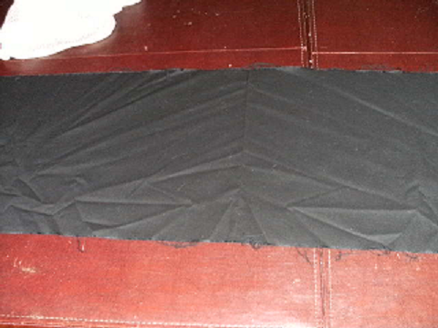
Once I had everything ready, I washed and dried my fabric in order to “pre-shrink” it and then I ironed out all of the wrinkles so I could make even cuts. Then, I laid the fabric out on the table and measured out three blocks that measured 11X12”. Using my colored pencil, I ran it against the measuring square so I had a very visible white line to make my cuts. From there, I cut very carefully along them. Go slow with this step. You may be eager to get to the fun part, but you’ll want these cuts as even and as straight as possible. It’ll keep your square looking sharp and prevent too much fraying. Once that was done, I had squares that I could then trace my various patterns.
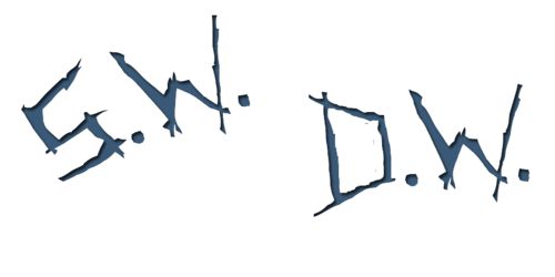
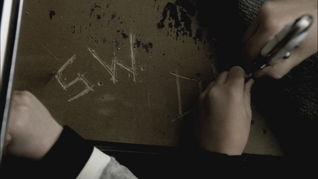
To create the pattern for the Initial Center Square, I needed to locate a good image of the initials We only see those initials for a brief moment in “Swan Song,”—and I don’t know about you, but I almost always see them through the tears on top of it—so, the actual initials in the show are a bit difficult to translate. What I did instead was find ones that kept the integrity, but would do well under Paint manipulations to resize and print for stencil making. This image was found at Pintrest and was done by Deb Rasmussen.
I saved the image to my computer and then I played with it in Paint until I had the initials about four inches wide for each set. You’ll have to just play with it until you feel comfortable with how it looks. If you want yours a bit bigger or smaller than mine, that’s fine. Once that’s done, cut each initial out very carefully from the paper. You’ll want to apply them to a piece of sturdy cardboard—I usually use masking tape but any tape you like will work here. I trace mine in pencil slowly and boldly. After that, I go over them again with a black permanent marker so I can make my cuts in the cardboard without losing the pencil lines. I find that it makes it easier to see and harder to smudge.
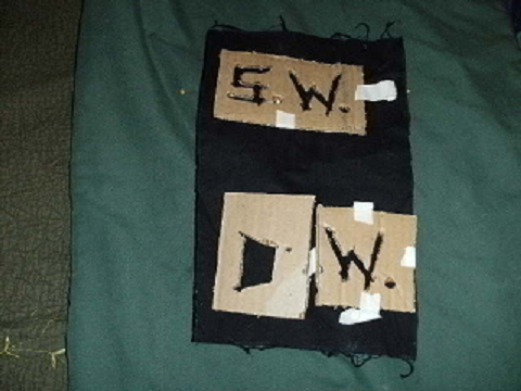
Once that’s done, I put the fabric square onto a flat surface and tape each initial set about where I wanted them. Again, you’ll have to play with it until you like their positioning. In the “Swan Song” shot, they’re fairly close together—as they are in the substitution image I used—but I spaced them some so I could then have them signed later on by Jared and Jensen.
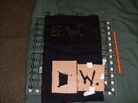
Here’s where it gets tricky. You could buy a special “transfer” pencil to trace the design onto your fabric. I’ve used them—but after I lost it a couple times I improvised with a colored pencil. Any color but black will do. I used an orange pencil to trace mine. I traced it slowly, carefully, and repeatedly to make sure the lines stayed bold and crisp. You’ll find that as you stitch that you may have to redo this again a few times—just without affixing the stencil again. Refresh these lines often enough and you won’t lose any of the integrity of the design. The upside to the pencil rubbing off is that you don’t have to worry about those drawn lines showing in the final product.
Now that you have the actual design on the fabric, we can get to the fun part!
I used two stitches for this particular square. The first is the backstitch to outline the lines you’ve carefully put onto the fabric, the second is the satin stitch to color it in.
First, the backstitch. I use two ply or two strands for this stitch. It makes it stand out on the fabric, yet keeps all the detail of the outline you’re creating. If you think it doesn’t seem bold enough, don’t fret. You’ll see how the satin stitch will change that in time. Right now, you just want to get those lines permanently etched onto you fabric.
Backstitch is simple. You pull the needle and thread through a spot on the drawn lines and make a tiny stitch. Then, you bring the needle back up again. Instead of making another stitch just like your first, you’ll go backwards and insert the needle back through that first stitch, preferably on the very edge of it. Hence, the term backstitch. To see a demonstration of the backstitch, you can watch this video.
I typically keep my backstitches tiny. The tighter and smaller the stitch, the better the pattern will emerge. I also find that it gives me the most control. On backstitch, you want to have as much control as possible. Do your stitches too fast or too big and you may find yourself going off pattern or unable to match the lines drawn. Don’t worry if it feels slow at first. The more you practice, the quicker you’ll be able to do this and the finer you work will really be. If you’re just starting, be patient and take each stitch slowly. I’ve been stitching since I was a little girl, and I often slow myself down just to keep my work as clean as possible. You’ll also want to go super slow on account of the thread you’re using. Metallic thread has an awesome look, but it tends to shred itself very easily. Too much friction or too fast on it, and you’ll start to see it unwinding and fraying itself. So go slow and easy to keep that thread looking nice, smooth, and sharp.
As you make your way around each letter, you’ll find that the silver is really starting to define the design beautifully. But what happens when you’ve completed that outline?
This is where we do the satin stitch. With satin, you’re coloring in your pattern. I use three strands for my satin simply so I can fill the pattern in that much faster and so that it’ll look even bolder. For this stitch, I pull the needle and thread up just next to my backstitch outline on the outside of the design. Then, I go to the opposite side of the design, covering it up with the thread. When I make my stitches, I always pull gently on each strand to make sure they’ll lay as flat as possible. You’re trying to make the final image a solid one, so you’ll want the thread to end up as smooth as possible. To see a demonstration of this stitch, please watch this video.
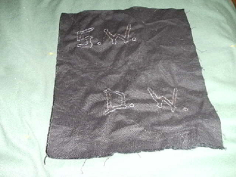
When I do my satin stitch work, I go even slower on it than I do my backstitch. This is the “finished” product, so you’ll want it to be as clean, crisp, and smooth as possible. Because I chose such a dark fabric and a shiny metallic thread, the initials will truly stand out and start to fill in as you go about following the outline you’ve put in place with the backstitch. You can see that here as this photo shows the filled in Sam initials while the Dean ones have yet to be colored in.
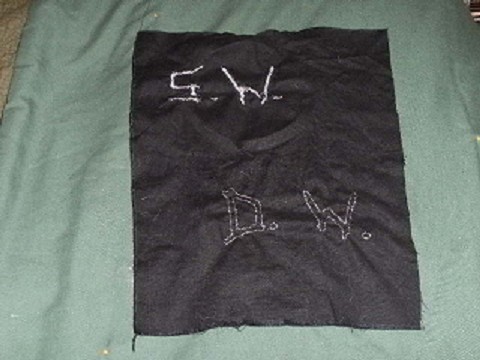
Once both sets are completed, you’ll have the chrome of Baby etched onto the black fabric in Sam and Dean’s initials. If that doesn’t symbolize this show, nothing will. I think it’ll be a great anchor for my Quilt and will make for a great autograph piece when I go to Cons. It’s unique and yet iconic of the show in so many ways.
But I’m far from done. The next square I have planned is the Mark of Cain. And after that, there’s still so many more symbols to stitch! If you have any SPN Quilt Square suggestions, please share and I’ll add them to my list. Who knows, I may end making more than one of these!

That is so cool, I love creative people. It’s very generous of you to share this innovative thought with us all. I’ll be looking forward to seeing your finished product. I’m sure Jared & Jensen will be very proud to sign that for you.
Thanks for the comment.
I’m glad you liked this first square so much. I spent all of season nine working on a much much larger project than this square, and decided that I wanted to do this along with it. I do hope you’ll like the subsequent squares as I work through them, too. I’m rather pleased with how these are coming together.
I really hope Jared and Jensen really like seeing this center square, too. I can’t wait to see their faces, actually.
Thanks again.