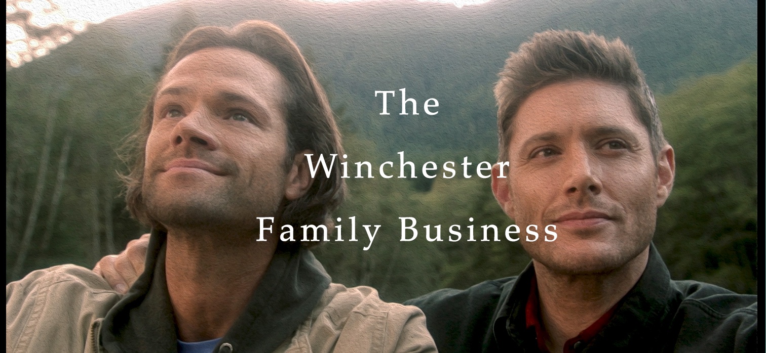
Welcome to the new Winchester Family Business site! The changes you see here have been on my wish list for a long time.
It wasn’t until a month ago when I got in my possession an amazing new web design tool that my grand visions could become a reality.
A reality without years of development anyway. The tool was intended for the design and creation of the new Supernatural Crossroads site, but I loved it so much I had to do this site too. Yes, there were some definite complications, but I was able to work through most of them. At least I think. Who knows I wonder how many messages I’ll get tomorrow having people tell me this doesn’t work on their computer.
So why redesign the site? Easy. When I started this site in January 2009, it was designed with one blogger in mind. One blogger posting maybe a couple times a week and offering nothing more than strong opinions, charming analysis, and just off the wall crap here and there. If you look at the author’s page, there are ten of us now. We’re posting two to three times a day. We are growing in leaps and bounds. In January, we hit a record 25,000 visits and 1.1 million page hits. That’s a ridiculous 2678% increase over our first month a year earlier. So, the old template wasn’t cutting it. We needed to step up.
Here is a list of the new and changed features:
– Separation of articles and news stories. The one huge bragging feature of our site is our meta and other great articles. We have a wealth of content unlike any other site and combining news and articles in one list was causing a lot of that great content to be lost. Now they have their own pages and are broken out on the front page in their own sections.
– Speaking of articles, you’ll also notice there is a new archive section. This makes it easier to find that content by categories. In the near future I’ll be even breaking up those categories into smaller chunks and as our content gets larger I’ll start working in some more archiving and searching features.
– The CBOX and Polls have their own pages now. They have become hugely popular and just too much for an already crowded front page. Polls are pretty much the same, except they have more breathing space for easier reading. The CBOX is the premium version now, so that means messages are now up to 500 characters and up to 40 messages can be displayed at a time on one page. That’s way better than that small window before. Their new sections can be found at the top menu.
– If you’re logged in, you can edit your comments now! We never could figure out why that didn’t work on the other site. I wasn’t able to edit comments or delete comments on the other site without going through the admin area either so now I can do that directly.
– I was planning on having a multiple video player at the bottom, but whatever worked on my local server doesn’t work on the main page on the live site. I’ll be researching options on that. In the meantime, videos can be found on individual articles still and they play fine. If you really think a multiple video player is a good idea, check out the one at thesupernaturalcrossroads.com. If you like it, I’ll see if I can get that for this site. It involves cost.
– This template was meant to be compatible with all browsers, something the previous template didn’t do so well. So, if that isn’t the case, please bring it to my attention.
– There will be a real authors section where each author gets their own profile page and the list of their articles underneath. The development is still underway on that, but it’s going slow. In the meantime, the “Who Are We†section is now the “WFB Authors†section.
– I’m still working on minor bugs here and there. Formatting errors, quirks, and little things like I noticed I’m missing the ratings page somehow (that will go on the News and Announcement page). If you notice anything, please report it to me in the “Contact Us†section, or even through Facebook or Twitter. I’ll get it addressed.
Got any suggestions? I’m committed to making our site comparable to some of the top entertainment sites out there. We only look expensive! Given the expansion of this site beyond one blogger page, we have far more flexibility now. Thank you everyone for all your support so far and I’m hoping you’ll consider us for all your Hellatus and rest of the season fixes.


Oh, I forgot to mention, anyone recognize the graphic in the background? First one to get it wins bragging rights.
It’s the graphic from the laptop the guys had in the first and second seasons.
Alice, the new site looks great! I’m still exploring but what I’ve seen already is wonderful. Thanks for all your hard work in making this such an awesome site to visit!
Alice – awesome new format! All your hardwork really shows – and pays off. I love it.
As for the background image – it’s from Deep Cove Bike Shop in Vancouver and, as Deborah said was on Sam’s laptop for a good while there. Off to explore some more now…
Well, I still can’t log in, but otherwise – WOW Alice, this is awesome. Who knew your enjoyment of a TV show would have lead here?
Congrats and hugs!
Just had to have an early morning quick look over here, and so far love what I see! The larger font is so much easier to read, love the background design from the laptop. cant wait to come back later today and wallow. Alice, can not thank you enough for all your hard work, we are very lucky to have you at the helm.
Hi Alice,
awsome new design! And now the site also says “Hi, Freebird” 😀 I feel so welcome 😀
My business-site is also done with a Joomla-template, and I love it. Love the comment editing (no more spelling-monster :-)). As for browsers, I’ve been using Opera for a while now, and it’s perfect. A friend recommended it to me, apparently it’s an off-mainstream browser with not many users and therefore pretty safe from bugs (doesn’t this sound like Supernatural? ;-))
Thanks so much for your work. This is the best Supernatural fansite ever!!!!
Love, Lara 😉
edited: No more Capchas?
Wow Alice, this looks amazing!!
Thank you for your hard work!
*off to explore*
Fantastic job Alice…
The site looks amazing.
Your hard work definately paid off.
Thank-you so much.
Now that I’m on a real computer, it’s amazing how smoothly everything runs, how quickly it loads, plus it’s aesthetically pleasing. And I haven’t gotten logged off! 😀
LOVE the site Alice! Looks great. Thanks
Just to put my vote in here, too – this site rocks, Alice! Love the look, the style, the elegance of it – I can’t imagine how much work you have to put in it, it must be lots and lots, but – to agree with Karen- it definitely pays off.
Love it. I’m so damn proud to be a part of this, I’m actually growing an inch….
Thanks for all your efforts! Three cheers! Jas
Alice, the redesign is amazing! Really excellent work! And you weren’t kidding when you said scarlet and gray. How could this Buckeye fan not love it? 😉
Alice,
The new site design is awesome! When I clicked to TWFB yesterday and got the notice that the site was undergoing an upgrade I cheered figuring some of what you’d hinted at back at our ‘staff meeting’ was coming to fruition.
It looks amazing!!!!
I haven’t been around much due to some heavy work loads (thank you God, it’s never a bad thing) and some heavy stuff elsewhere but I’ve been lurking now and again. I’ve got an article in mind but just haven’t got the creative juice to bring it to anything other than the outline stage and the ‘kicking around in my brain’ stage.
Ah well.
THe site looks fab and I’m so thrilled to see there are ten authors and having read them all over time we are really and truly blessed with an array of talent.
So glad you were able to find ways to bring so much of your vision to bear, can’t wait to see what else comes along.
Elle2