Visual Review: Supernatural 10.11 “There’s No Place Like Home”
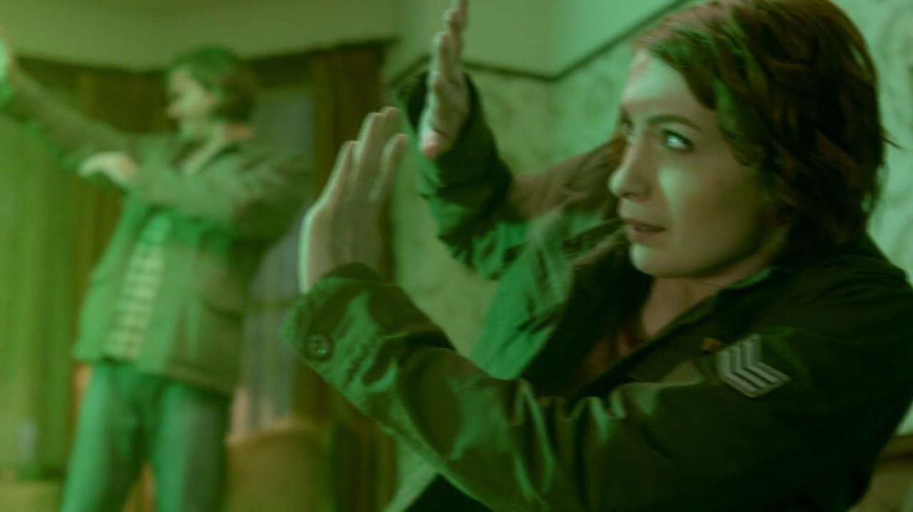
Superb cinematography has long been a hallmark of Supernatural. An extremely talented team comprised of Serge Ladouceur (Director of Photography), Jerry Wanek (Set Design), Phil Sgriccia (Director), wardrobe, camera crews and many other dedicated people work together to create both conscious and subconscious messages that added to our viewing experience of Supernatural’s “There’s No Place Like Home”.
By definition,
“A cinematographer or director of photography (sometimes shortened to DP or DOP) is the chief over the camera and lighting crews working on a film, television production or other live action piece and is responsible for achieving artistic and technical decisions related to the image. The study and practice of this field is referred to as cinematography. Some filmmakers say that [the] cinematographer is just the chief over the camera and lighting, and the Director of Photography is the chief over the all photography components of film, including: framing, costumes, makeup, lighting, and its the assistant of the post producer for color correction & grading.” – Wikipedia
Looking at the directorial choices and composition of the scenes, including color, angles, lighting, props and wardrobe, adds a whole new level of meaning to the story.
Green and Yellow
Two of the color schemes within “There’s No Place Like Home” were obvious choices. Green is universally associated with the sparkling Emerald City, with yellow being the color of the road that winds its way through all of Oz. These two colors were used prominently thoughtout the episode. In the very first scene outside the district attoryney’s house, the yard light glowed green, highlighting extremely green grass. Lawns are meant to be green so the accent of the color didn’t seem unusual. These shots were quickly followed by specific placement of green, though:
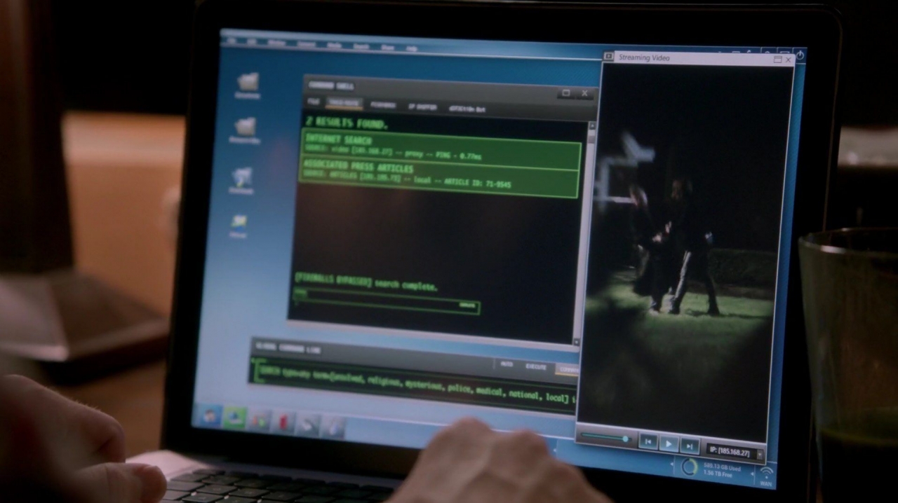
Sam’s computer screen was highlighted in green,
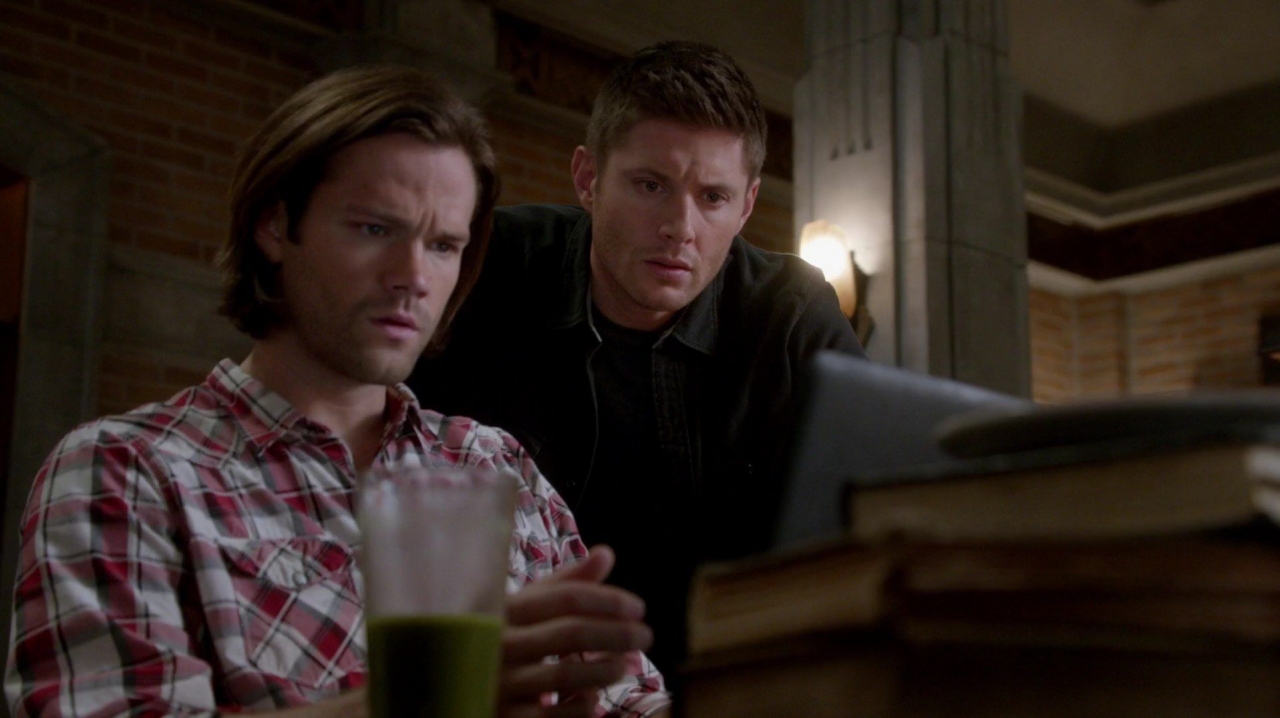
Dean’s vegetable juice/shake was green. In this shot, the glass was even placed in the foreground to catch our attention.
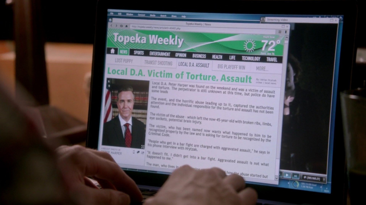
The masthead for the local newspaper carrying the D.A. attack story was green.
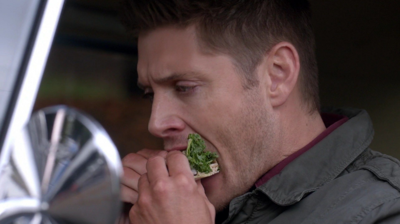
Green kale prominently stuck out of Dean’s pita sandwich. It was virtually the only splash of color present amid the greys and silvers of the car. Later in the episode, green lettuce was the only thing left on the trio’s lunch plates at the bar.
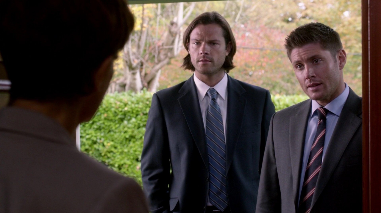
Green is used as background for most of the scenes with the councilwoman. It was present in seemingly inconsequential shots, such as when the brothers stood on her front porch.
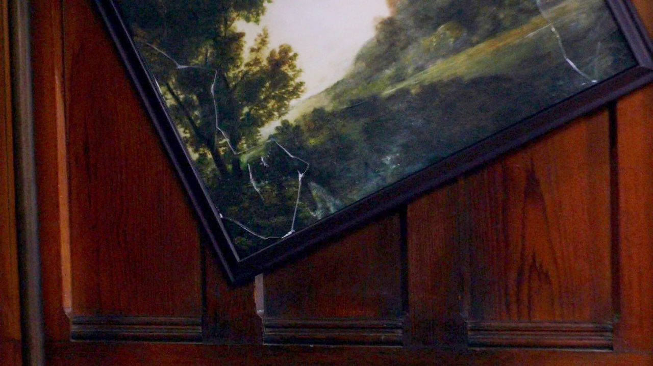
The walls in the councilwoman’s house were green, and there were specific pauses on the green landscape painting.
The stained glass windows in the house were green (and red, which we’ll talk about later), and there was a green pillow on the couch. The use of the peach/pink color for her shirt and window curtains provided a neutral backdrop to the action.
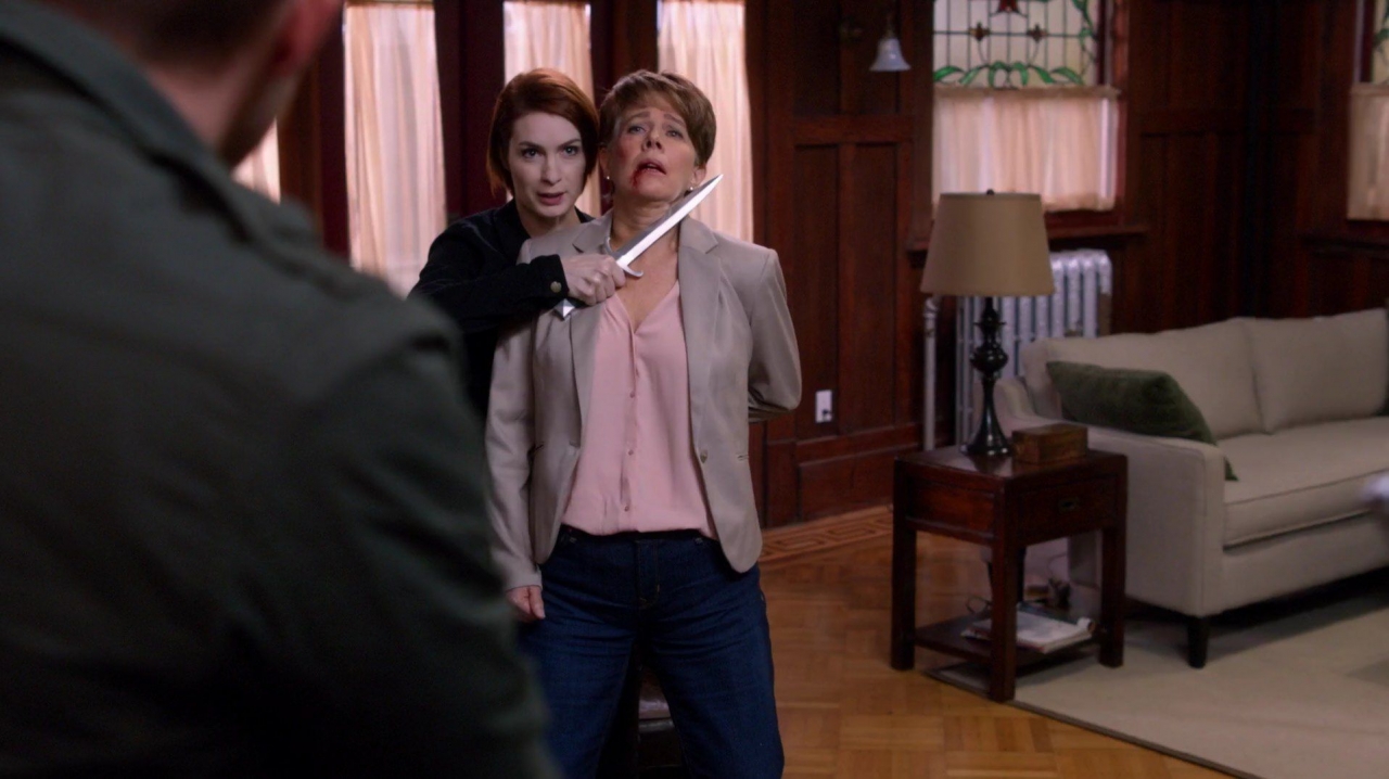
Sam’s jacket reflected green in the house; then his shirt reflected muted green in the bar. Then, of course, there was the bright green that invaded the living room from Oz, announcing the Wizard’s arrival. His cloak was also a dark green.
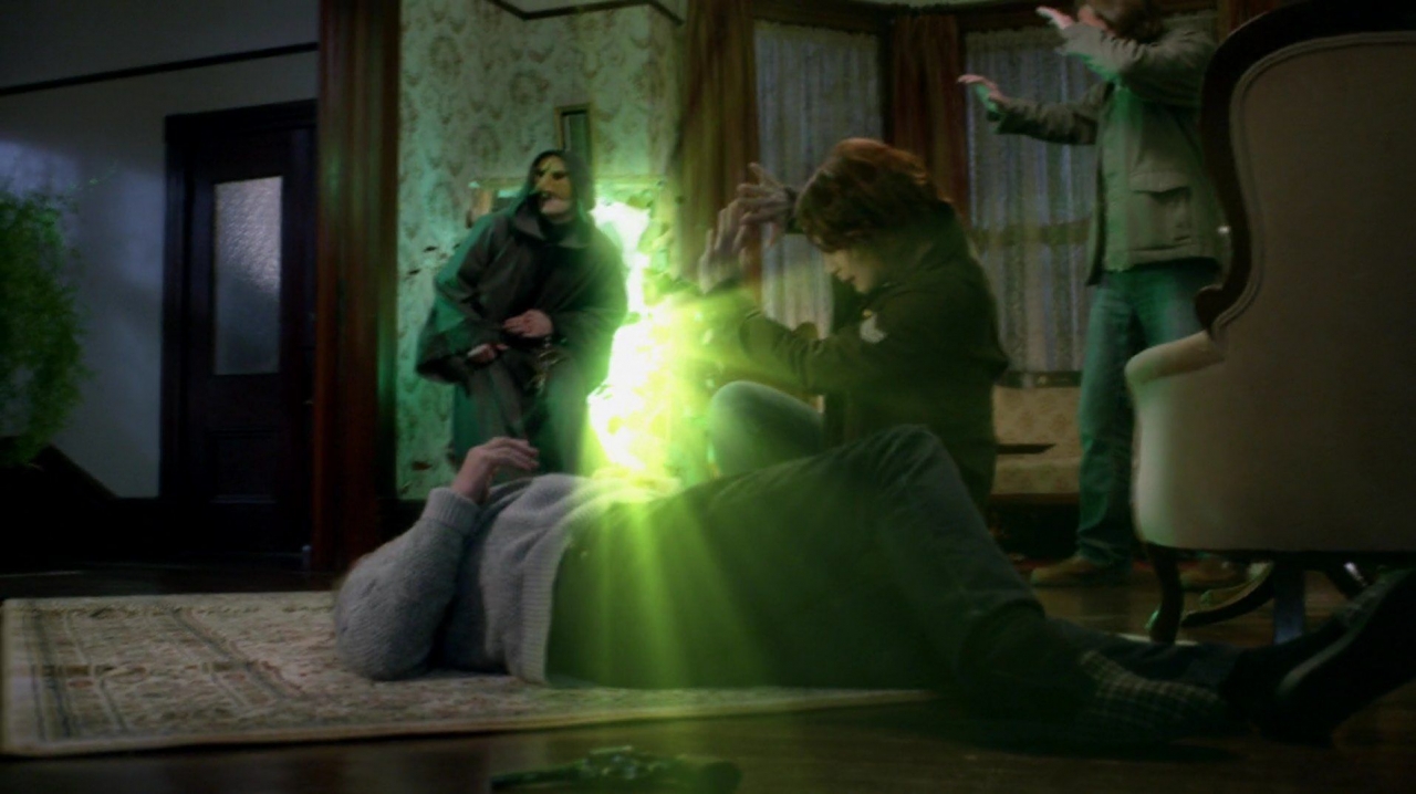
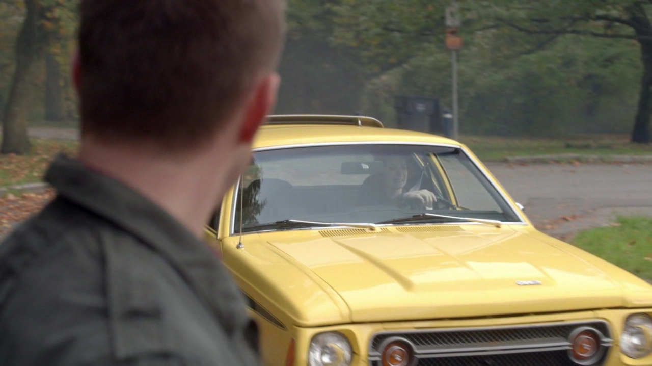
Yellow was also used in several shots. It always accompanied GoodCharlie, maybe as a reminder of her association with Dorothy, and the fact that they had both traveled the Yellow Brick Road. We first saw GoodCharlie in the shocking yellow car.
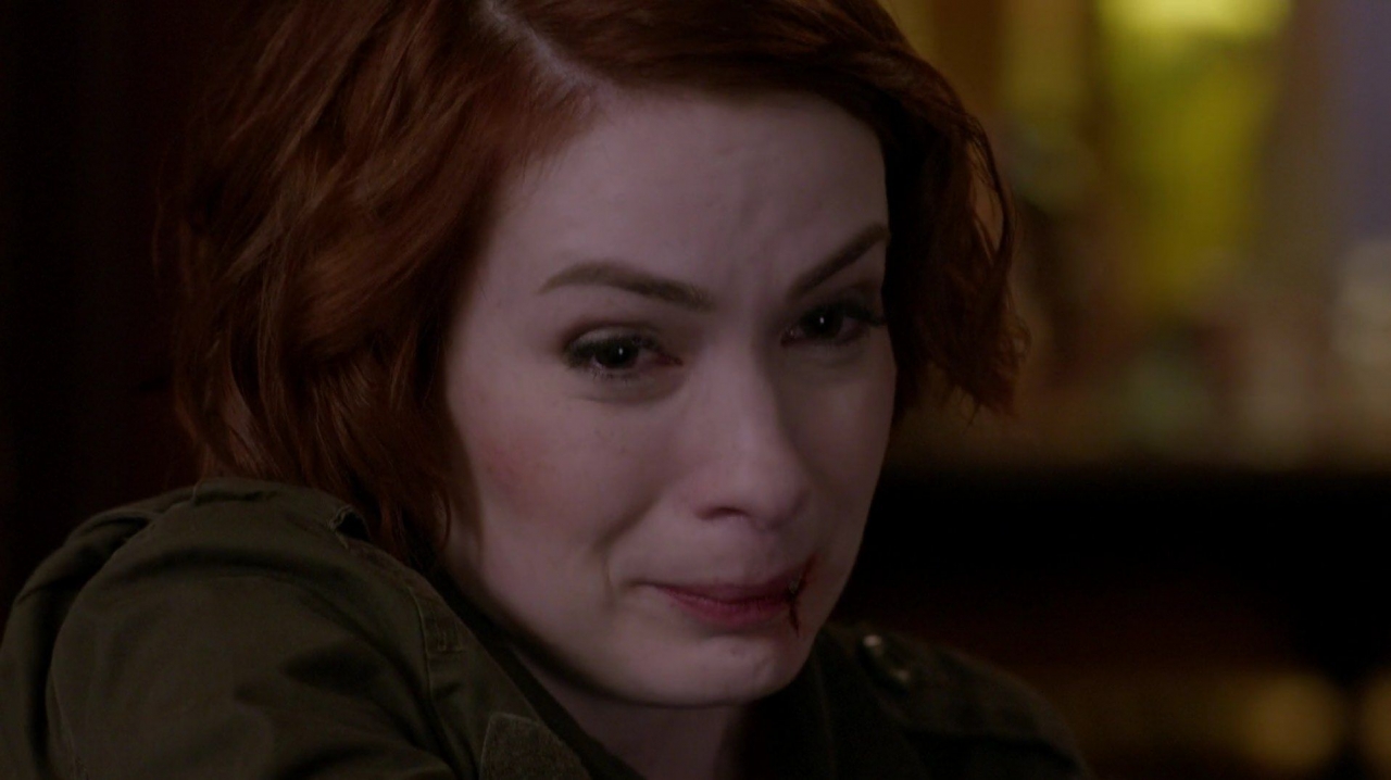
Yellow was used as background in her closeups, and was the only “light” in her dire moment of having to kill an innocent man.
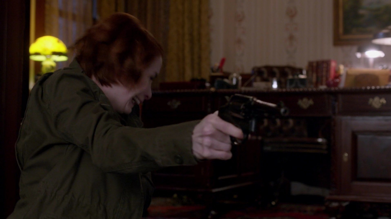
Fittingly, yellow was the color of the house of the MoL survivor who had himself been to Oz. Conveniently, the yellow then served as the backdrop to Charllie’s reunification.
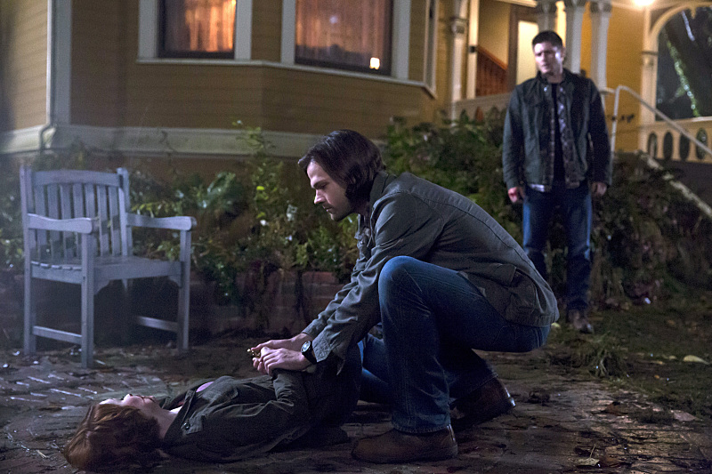
Red and Blue
Perhaps just as predictable as green and yellow, red and blue were used throughout the episode. Red is the color of rage (hence the expression, “Seeing red”), while blue is the color of peacefulness, trust and calm. These colors, then, perfectly contrasted the separation of bad from good, or rage from peace.
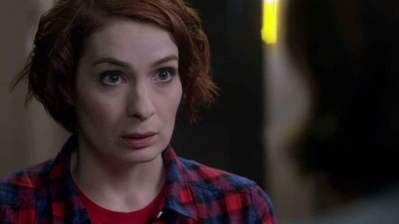
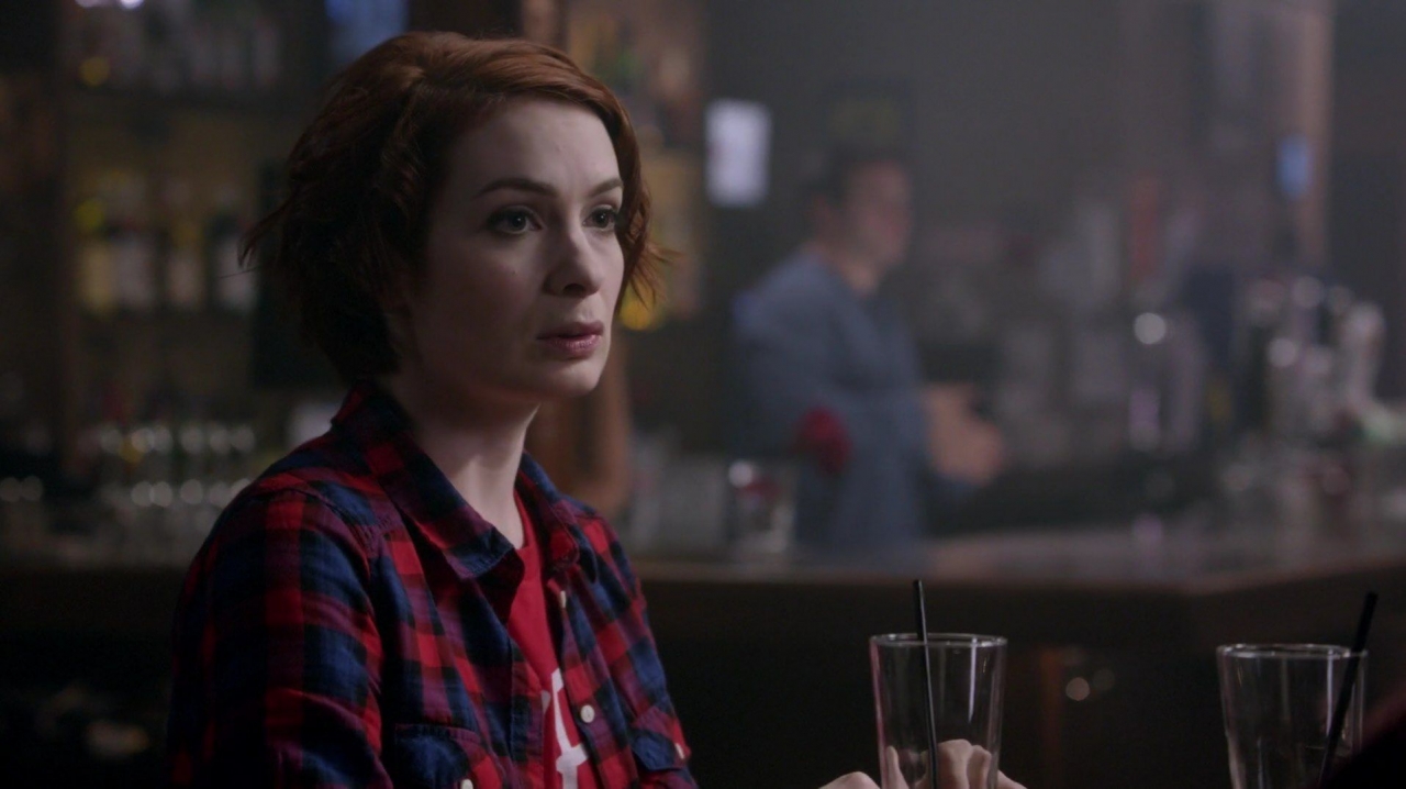
The placement of red was at first confusing, though. Dean wore a red shirt in the bar with Charlie. That made sense since Dean is currently fighting the onslaught of rage. GoodCharlie, though, also wore a red shirt, even though she was entirely without anger, hate or any violent intentions. In fact, she wore two red shirts – a t-shirt under a bright red and blue checked shirt (notice the bright yellow light that framed all of her close-up shots). The use of blue here is interesting, as it seems to be in equal size, and thus strength, with the red. Perhaps she was wearing red to try to balance herself, i.e. she lost all her rage so she was trying to artificially add some to her personna and image.
Red accents filled the bar, such as the red flower in the background behind the conversation in the bar and red candles on the tables. There was also a red arrow behind Sam’s head in his close-up shots, with a red picture being the only distinguishable color behind him in the doorway.
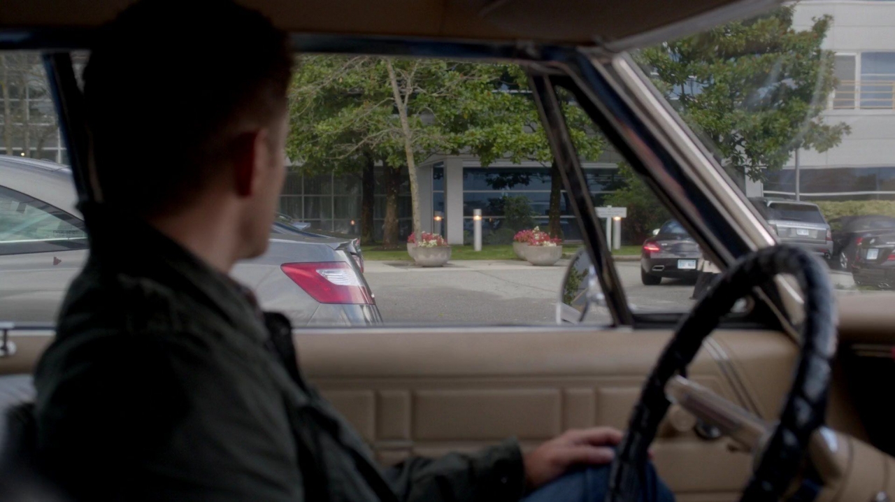
Outside Russell’s office building, the red of the flowers in the planters and the cars’ tail lights stood out against the neutral grays, tan and black. Green was the only other color in the shot.
Red and green were also prominent in the architectural graphic in the building’s lobby.
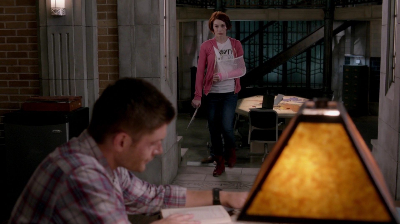
Back at the bunker, Charlie changed into a different shirt, but it was again a two-toned red.
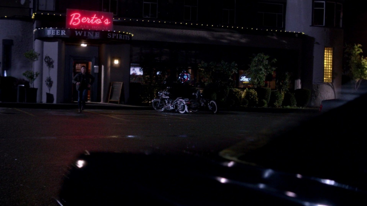
Bertos had a red sign with yellow lights above and to the side.
Red and green lights were the only colored lights glowing behind Sam as he walked through the bunker towards the end of the episode. Interestingly, after Charlie was reunited with her dark self, her sweater was pink i.e. muted red, signifying the goodness taming the rage. She was wearing red boots, too. Whereas Dean’s shirt was previously a solid red, it now had some blue in it. I interpret this as a symbol that he was trying to tap into, or maybe he had found, some of his goodness. The red on his shirt was muted by white and blue just as Charlie’s wardrobe was the blended combination of red, white and blue. Dean and Charlie were both whole, with both good and bad in them struggling for dominance.
The use of solid blue for the scenes surrounding Russell was curious. Obviously, Russell was not to be trusted, yet the hue signifying trust surrounded him. The lobby carpet, the lobby’s giant decoration,
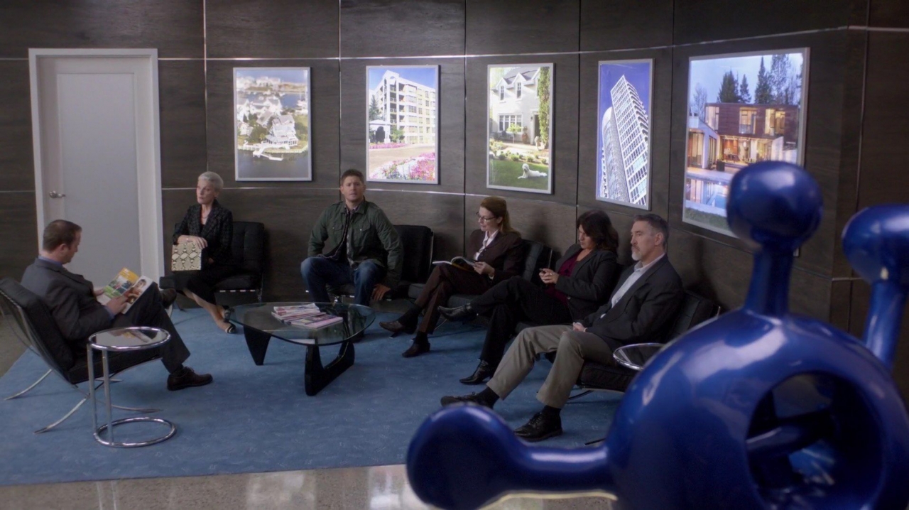
… Russell’s tie, the receptionist’s dress and blazer, Dean’s shirt, blue awards on the wall, all the shadows behind Russell…
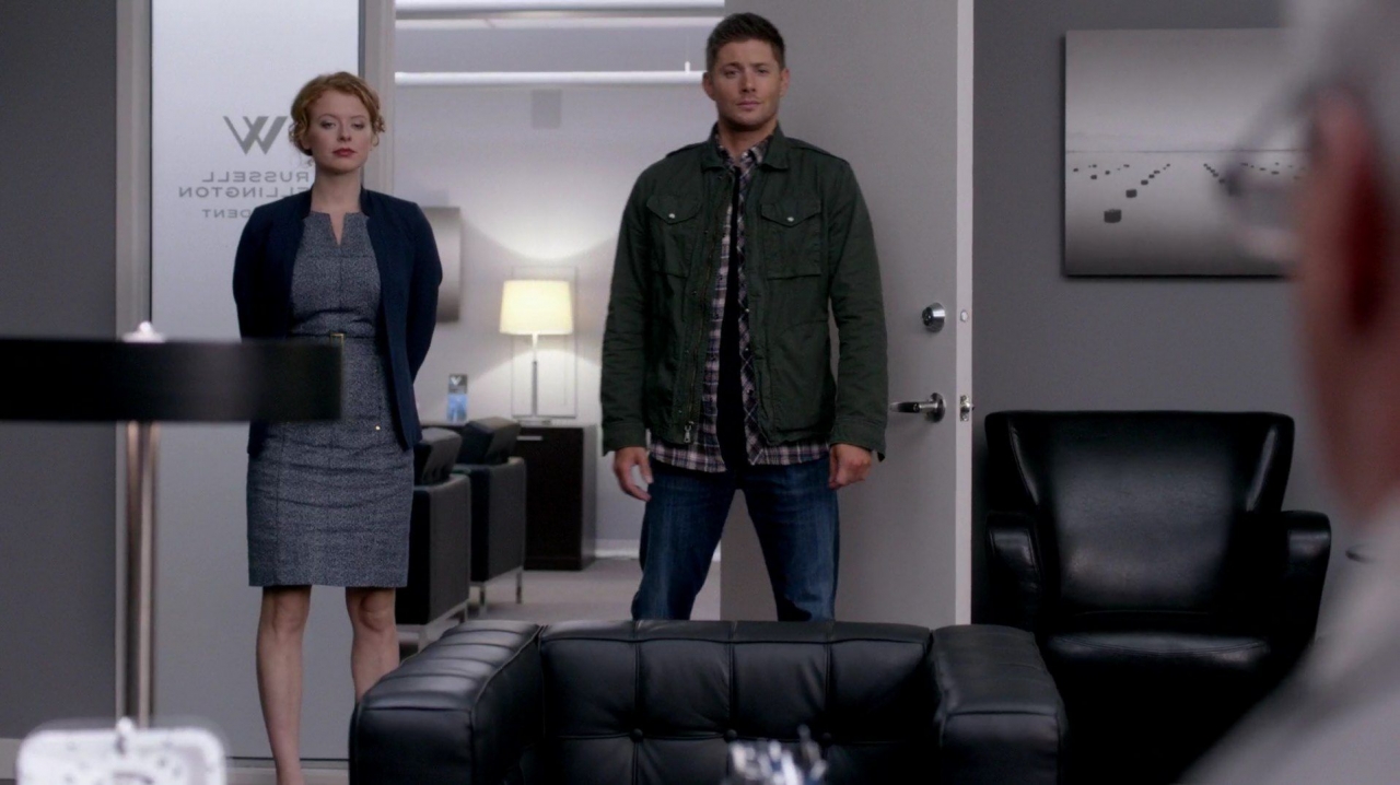
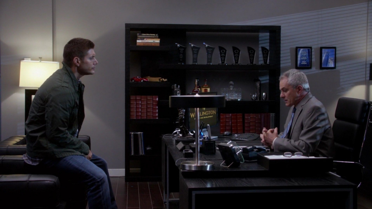
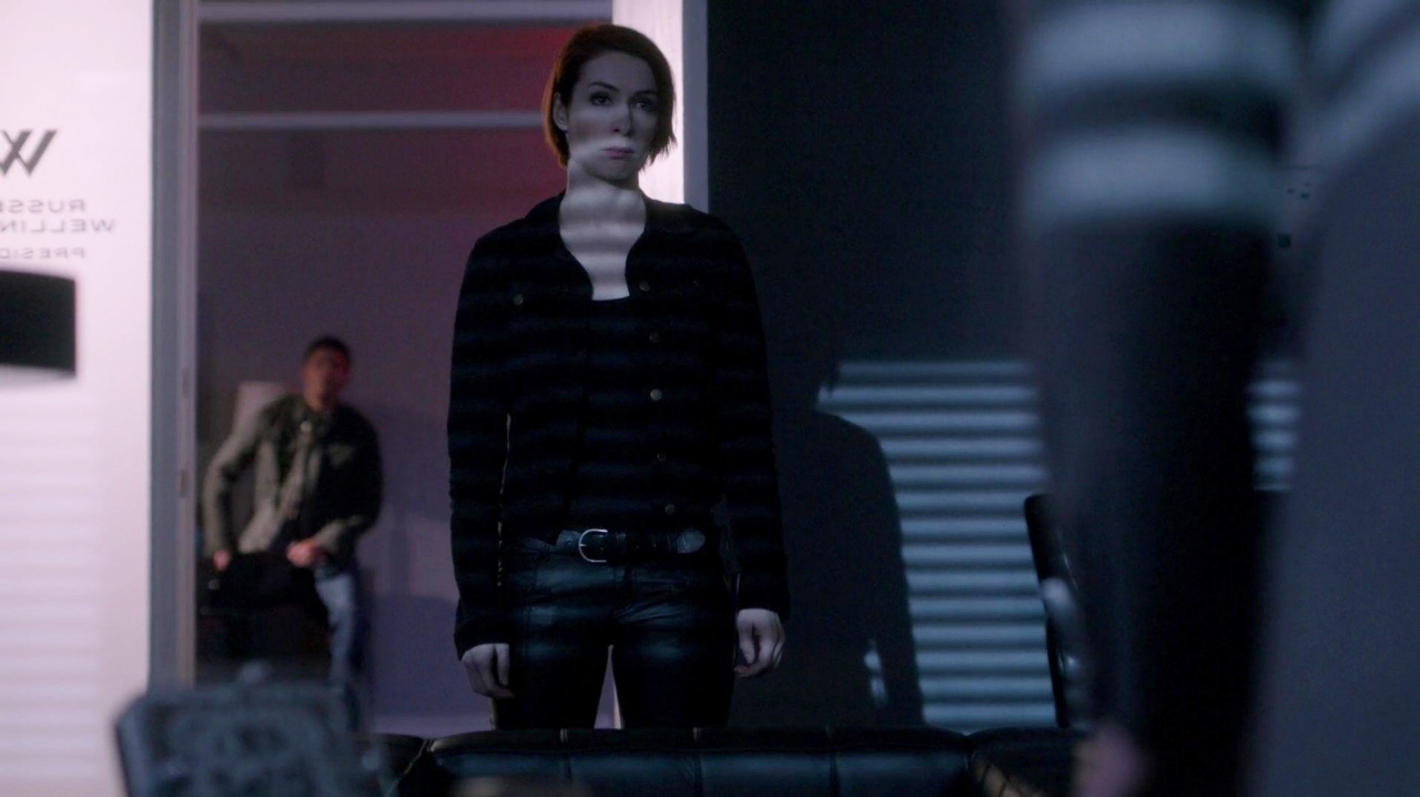
… DarkCharlie’s jacket, and the reflection on her blade were all blue. In contrast to her veiled calm, Dean was shown in the background bathed in red light. It was almost as if the opposite colors were being used to misdirect. DarkCharlie had channeled her rage into pending violence, while Dean was too calm.
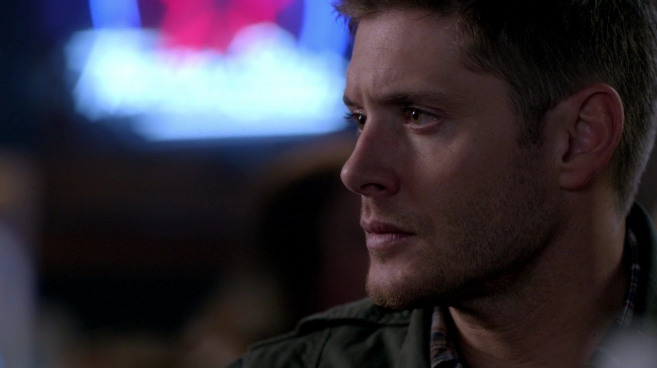
Previously in the bar, blue and red neon highlighted the battle within Dean.
I thought it was interesting that the Oz magic from the key that reunited the two halves of Charlie’s soul was blue, not green. My conclusion was that being reunited was a “good” thing. I’m open to other ideas on this, though.
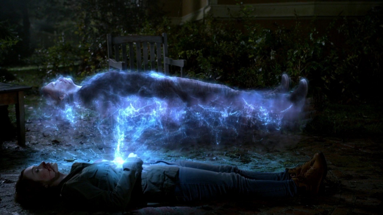
Single Images
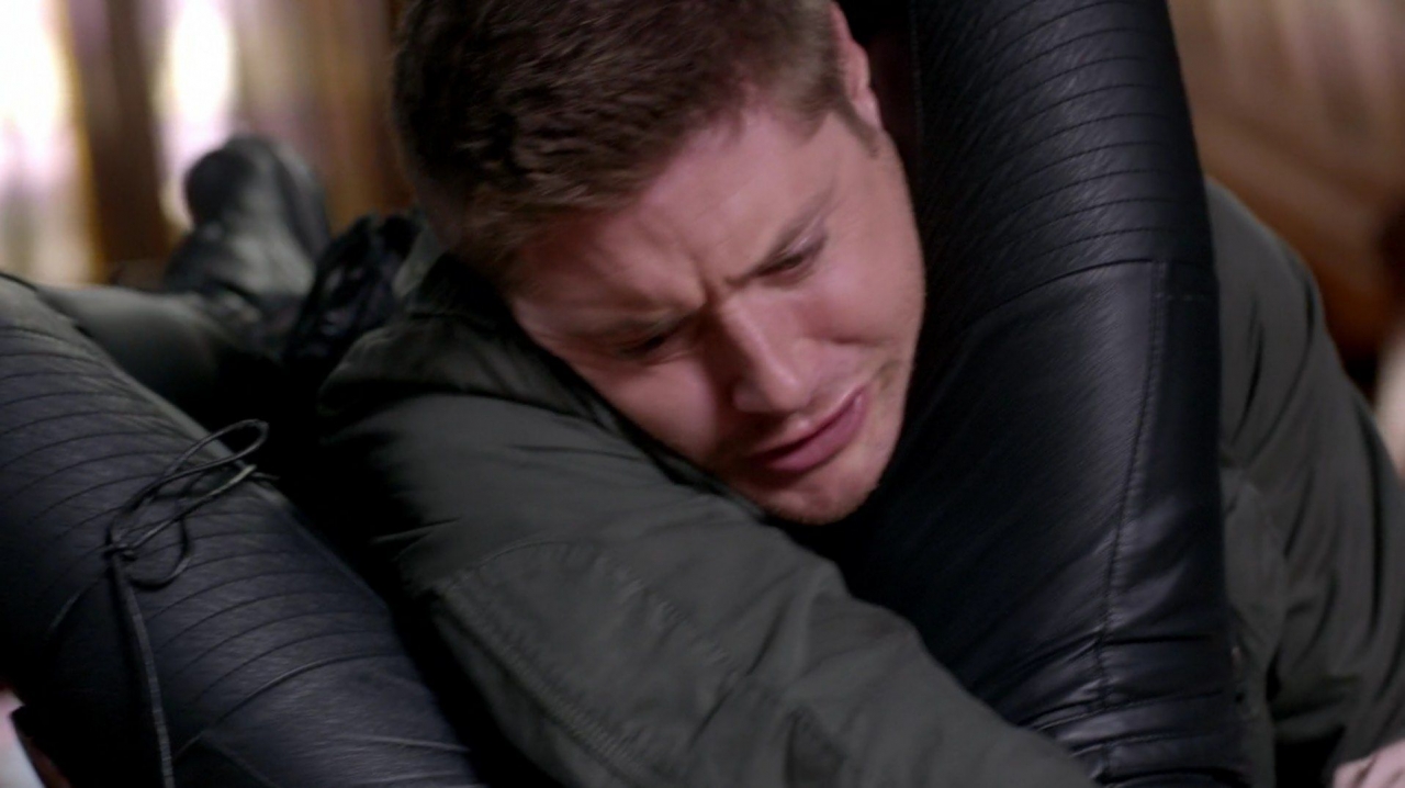
Aside from the color used symbolically throughout the show, there were several camera shots that deserve recognition for their uniqueness or their ability to convey a message. The most significant conclusion I drew from many of the shots was that Felicia Day had the best job ever!!
She got to put Jensen Ackles into a choke hold with her legs.
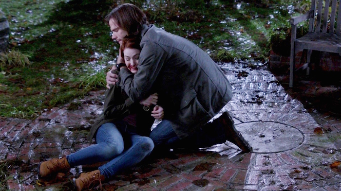
She got to be carried in Jared’s arms and then cradled and comforted by him.
and she got a hug from Jensen…
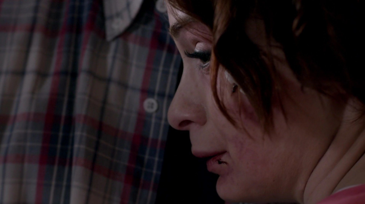
…and a few minutes later from Jared (shown below). Some girls have all the luck!
Best Shots of the Episode
A few shots distinguished themselves either because of the angle, the composition or the message they conveyed. The special effect of the wizard jumping through the mirror was outstanding and probably will be one of the more memorable of the episode. The following were outstanding because of simple camera placement, though, so they deserve a mention. Here are my top 5:
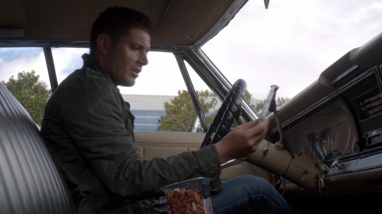
“The Conflict in of Dean’s Life”
#5 A motivalional “new age” tape just doesn’t belong in Dean’s classic muscle car, capturing the confusion Dean is feeling about trying to tame his basic nature to fight, be in constant motion, and rock and roll. This is a rare shot, if not the first shot, of the entire drivers side of the Impala with Dean at the wheel.
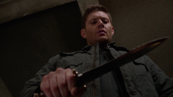
“The Dominance of the Blade”
#4 Dean’s hand shook as he held a simple (huge) knife, a tool of his trade but a menacing fear in his life now.
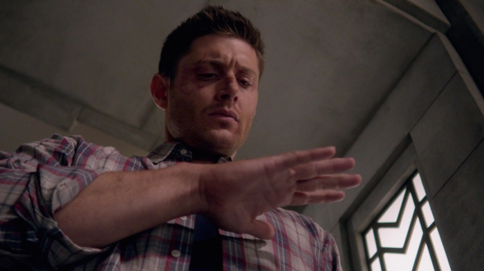
“Dean’s Confusion”
#3 Dean’s hand was steady at the end of his ordeal. Was it because he had given into violence or because he had been given forgiveness?
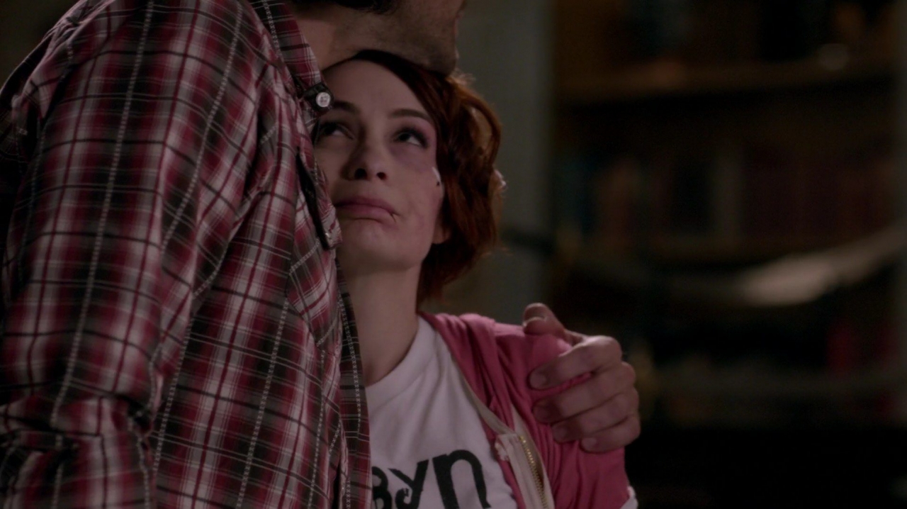
“Shared Pain and Friendship”
#2 I love the color composition of this shot, and the framing of Charlie’s tiny presence against Sam’s huge size. Her look up at him is touching as they draw strength and comfort from each other.
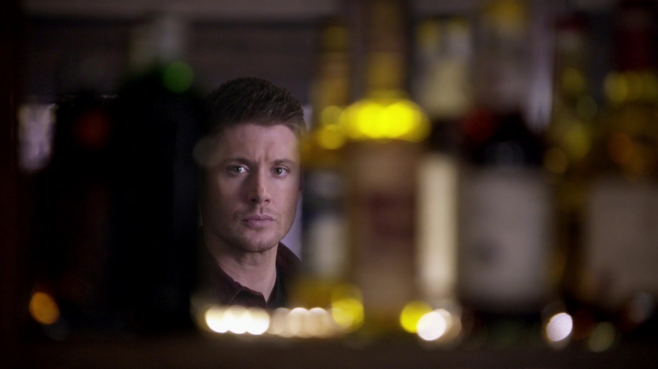
“Dean’s Life, Framed in Alcohol”
#1 Dean relfecting on who he is becoming, and on the absent crutch of alcohol that had always helped him get through his life’s trials. In one shot, yellow, green and red combined the episode’s themes as reflection off the bottles.
It has been so much fun sharing my observations of the cinematography in “There’s No Place Like Home”. Did you see things I missed? What were your favorite shots? What are your interpretations of the use of color? Can you offer different or better captions to my top 5 pics? I’d love to hear from you!
– Nightsky
P.S. In case you don’t read through the comments, an honorable mention goes to Lilah_Kane who reminded me that the color red brought Dorothy home from Oz! Of course, the Ruby Slippers! The magic was in Charlie the whole time! Charlie’s wardrobe and red boots suddenly have a whole new meaning. Thanks Lilah!



Charlie got to drive the Impala too! 😮 In your first screen cap Dean is dressed almost all in black. At the end of the episode, I think the last shot Dean is dressed in Sam’s shirt from last episode (well maybe one just like it :)) and a black shirt underneath. Maybe the struggle with good and evil in Dean is at an impasse. So maybe you were right about Dean being able to control the evil inside him and that is why his hand steadied. So Sam had the same red shirt on the whole episode…hmm. That was the only other visual I noticed. That and someone needs to explain the telescope.
https://www.thewinchesterfamilybusiness.com/images/SeasonTen/11-TheresNoPlaceLikeHome/normal_SPN1011HD2825.jpg last shot.
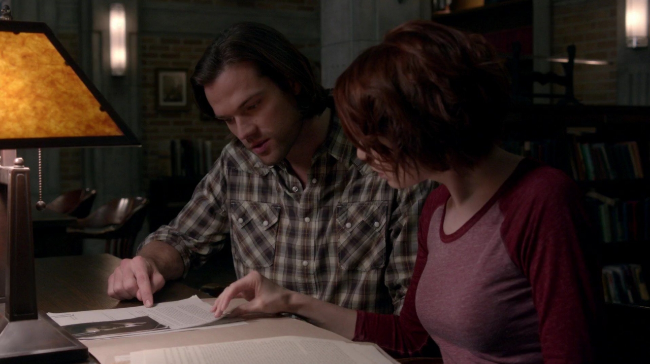
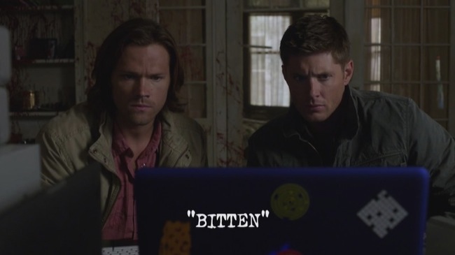
Sam’s shirt looks green when he is researching with Charlie (pic above).
The telescope has been in the bunker since day1. Maybe the MoLs toyed with astronomy/astrology as some of their tools to figure out the supernatural.
Your right Sam had a red one on when he was with Dean and a green one on when he was with Charlie. I would just love for the boys to acknowledge one day that they have a big ass telescope sitting right there behind them.
Wizard of OZ was my favorite movie when I was a kid. I loved TOTO and I liked the black and white at the start and the colors when Dorothy arrived to OZ.
If you think about the movie and that it is titled “There is no place like home” There might be another reason that Good Charlie dressed in red shirts. When Dorothy left from OZ the first time and she said that famous phrase she had the sparkly red ruby slippers on her feet. She didn’t need them of course because the magic was in her the whole time. 😉
So red color shirts might be just as easy comparison as that. And of course the ruby slippers were also in the Slumber party episode.
– Lilah
Well I feel foolish! All the time I looked at those red boots and I never once thought of the ruby red slippers! Even after Dark Charlie said the magic was in you all along! That’s why I need you all to help with these interpretations!
Well it’s nice to see that the production team is still really on their game even if I am not all that thrilled with the quality of the writing at the moment. This was very interesting. I wonder what the significance of Charlie’s black outfit along with Dean’s black T-shirt might be? Black has always been a dark or “evil” color. Maybe to signify that without balance in their lives then they cannot control that dark side of themselves while they have no balance? Do you think that this means that despite all of Dean’s attempts by giving up drink and eating kale that he does not have balance? Wasn’t Dean still wearing black under his red and blue plaid at the end of the ep? It could signify that he’s still hasn’t got a real resolution to his problem while Charlie was completely without any black at all at that point.
I think I agree with your theories. I would guess that the show’s producers would use black to imply darkness. Charlie said herself at the end that she felt balanced, so I interpret red and white i.e. pink, to be her rage (at her parents’ deaths) and her natural peaceful self hamoniously coexisting. She said Dark Charlie was “quiet”, so that could be why she wasn’t feeling, or wearing, any “black”. Dean’s black shirt being under, or hidden, by the outer red (rage) and blue (calm) shirt could be very symbollic. His darkness,or his inner demon, i.e. his guilt and self-loathing, is always hidng behind the emotions he shows to the world. He can cover up his deepest problem, but it is still closest to his heart and his core. Untl he forgives himself, he can’t shed his “black”. I love this next level of analysis! Thanks for suggesting it! Glad you enjoyed the aticle!
I just wanna say how much I loved reading this and all the ones you do like this!! I’m a graduate student studying/working to be a DP/cinematographer and the lighting and color palettes of these episodes consistently blow me away by their awesomeness. Shout to the Director and set design!! They nail it every week! I seriously nerd out over this stuff, screen-cap episodes and bring them to my professors who gaff professionally or are cinematographers just to quiz them on lighting set up etc . Reading your article makes my WEEK! THANK YOU!!!
Kate,
You comment was so inspiring to me! Thank you for writing it!
Did you know that a previous WFB editor also used to do Visual Reviews for us? She stopped 1.5 years ago, but all her articles are still in our archives. Go into one of our search boxes and type [i]A Visual Review[/i], then push the button for “Exact Words”. It will bring up all her cinematography reviews from S8 and before. Did you also see the cinematography article by a guest writer, Ash48? Her article started me on this series. Here is the link to her article: https://www.thewinchesterfamilybusiness.com/article-archives/episode-related/18951-curled-around-these-images-cinematography-supernatural-episode-10-09-the-things-we-left-behind
It was outstanding!